Data Wrangling
Using tidyr
What is tidy data?
Aspect of data cleaning that structures a dataset to facilitate analysis
Resource: follow along
tidyrvignetteavailable as
vignette("tidy-data", package="tidyr")vignette is version of the tidy data paper with updated code
Outline
Different sources of messiness
Key-Value pairs
tidyr:pivot_widerandpivot_longer,separate
Data is usually in a spreadsheet format, but…
There are different ways of encoding the same information:
| Patient | Treatment A | Treatment B |
|---|---|---|
| John Smith | NA | 18 |
| Jane Doe | 4 | 1 |
| Mary Johnson | 6 | 7 |
Option 2:
| Patient | John Smith | Jane Doe | Mary Johnson |
|---|---|---|---|
| A | NA | 4 | 6 |
| B | 18 | 1 | 7 |
Option 3:
| Patient | Treatment | Score |
|---|---|---|
| John Smith | A | NA |
| Jane Doe | A | 4 |
| Mary Johnson | A | 6 |
| John Smith | B | 18 |
| Jane Doe | B | 1 |
| Mary Johnson | B | 7 |
Sources of Messiness (Review)
Five main ways tables of data tend not to be tidy:
Column headers are values, not variable names.
Multiple variables are stored in one column.
Variables are stored in both rows and columns.
Multiple types of observational units are stored in the same table.
A single observational unit is stored in multiple tables.
What we have and what we want
Wide format
some variables are spread out across columns.
typically uses less space to display
how you would typically choose to present your data
far less repetition of labels and row elements

Long format
each variable is a column
each observation is a row
is likely not the data’s most compact form
Remember from Graphics
Tidy Data
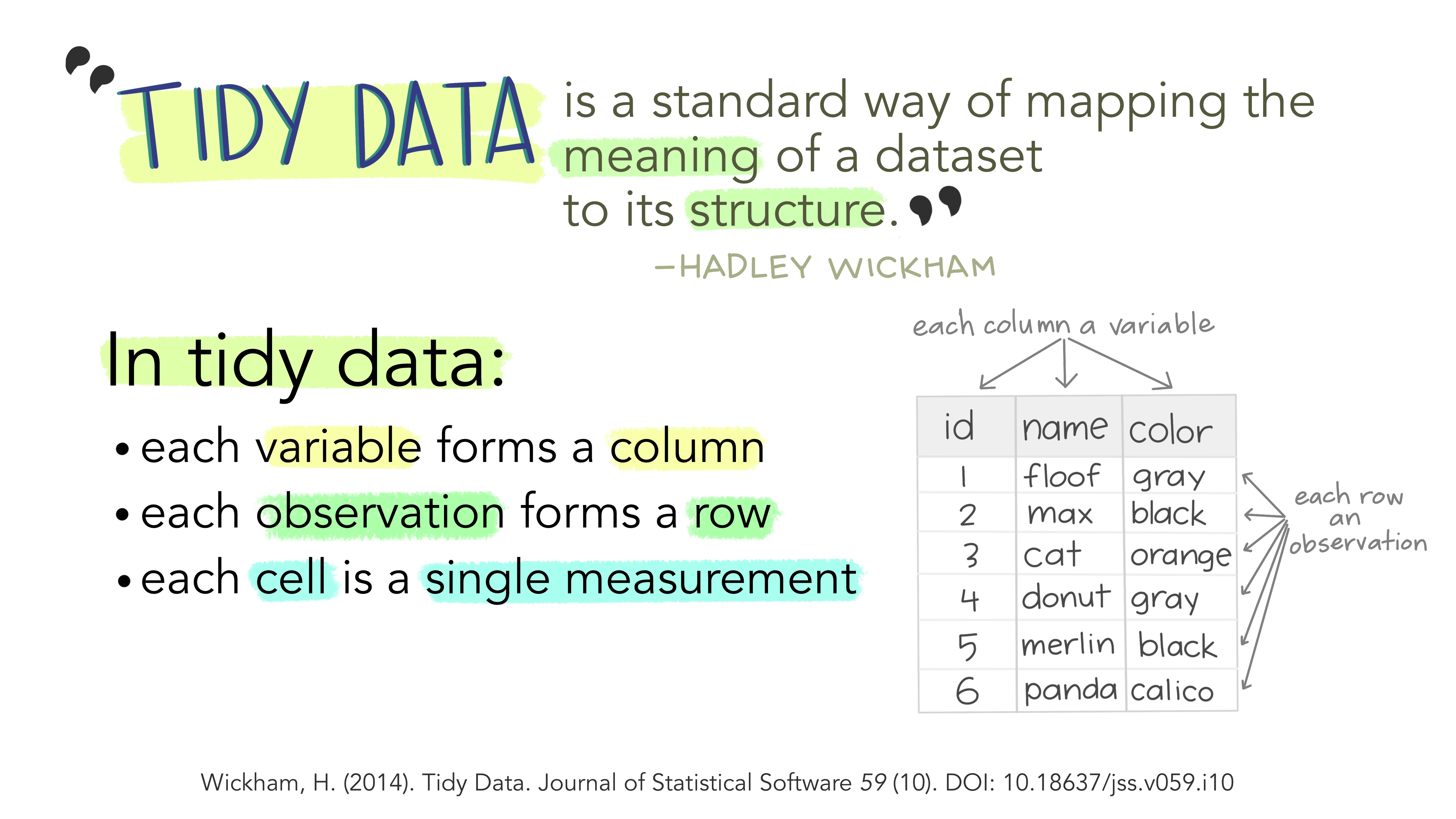
Each variable is a column
Each observation is a row
Each type of observational unit forms a table
| Patient | Treatment | Score |
|---|---|---|
| John Smith | A | NA |
| John Smith | B | 18 |
| Jane Doe | A | 4 |
| Jane Doe | B | 1 |
| Mary Johnson | A | 6 |
| Mary Johnson | B | 7 |
What makes data tidy?
| Patient | Treatment | Score |
|---|---|---|
| John Smith | A | NA |
| John Smith | B | 18 |
| Jane Doe | A | 4 |
| Jane Doe | B | 1 |
| Mary Johnson | A | 6 |
| Mary Johnson | B | 7 |
TreatmentandPatientuniquely describe a single row in the dataset.TreatmentandPatientare key variables,Scoreis a measurement variablethis makes
Treatment-PatientandScorea key-value pair
Key-value pairs (KVP)
Key-Value pairs (KVP) - also attribute-value, field-value, name-value: abstract data representation that allows a lot of flexibility
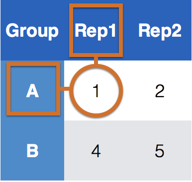
One way of telling whether a data set is tidy is to check that all keys for a value are aligned in one row:
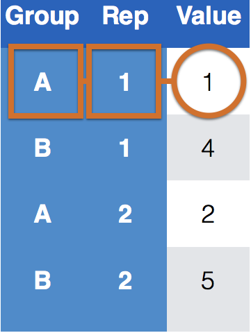
Key-value pairs (KVP)
Keys/Identifiers:
Identify a record (must be unique)
Example: Indices on an random variable
Fixed by design of experiment (known in advance)
May be single or composite (may have one or more variables)
Values/Measures:
Collected during the experiment (not known in advance)
Usually numeric quantities
Let’s ask for help…
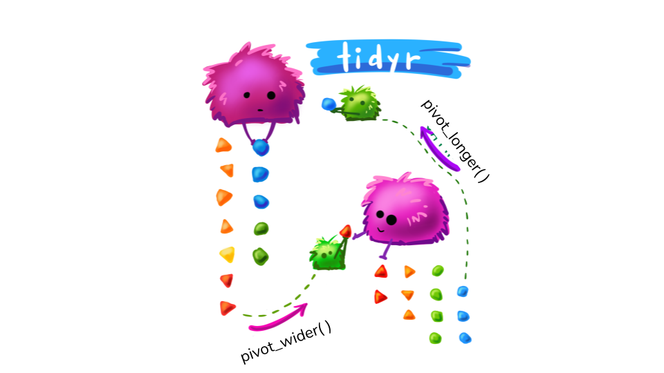
Pivot Monsters drawing by Allison Horst & adjusted by R ladies Sydney
Tidying data - Plan of attack
Messy (1): tidyr functions:
pivot_longer (data,names_to,values_to, ...): take multiple columns and collapse into key-value pairs
pivot_wider (data,names_from,values_from,values_fill = NA): spread a key-value pair across multiple columns.
Messy (2): tidyr function separate (data, col, into, sep = " "): separate one column into multiple columns
Messy (3): dplyr : a combination of the functions discussed previously today
Messy (4): dplyr functionality join (and friends) to combine multiple data sets
Untidy data
| time | treatment | subject | rep | potato | buttery | grassy | rancid | painty | |
|---|---|---|---|---|---|---|---|---|---|
| 61 | 1 | 1 | 3 | 1 | 2.9 | 0.0 | 0.0 | 0.0 | 5.5 |
| 25 | 1 | 1 | 3 | 2 | 14.0 | 0.0 | 0.0 | 1.1 | 0.0 |
| 62 | 1 | 1 | 10 | 1 | 11.0 | 6.4 | 0.0 | 0.0 | 0.0 |
| 26 | 1 | 1 | 10 | 2 | 9.9 | 5.9 | 2.9 | 2.2 | 0.0 |
| 63 | 1 | 1 | 15 | 1 | 1.2 | 0.1 | 0.0 | 1.1 | 5.1 |
| 27 | 1 | 1 | 15 | 2 | 8.8 | 3.0 | 3.6 | 1.5 | 2.3 |
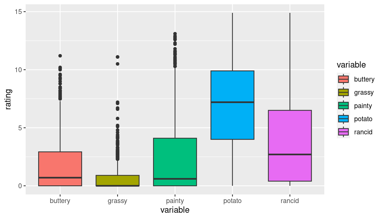
This format is not ideal for data analysis
library(ggplot2)

ggplot(french_fries) +
geom_boxplot(aes(x="1_buttery", y=buttery), fill = "cyan4") +
geom_boxplot(aes(x = "2_grassy", y = grassy), fill = "darkorange2") +
geom_boxplot(aes(x = "3_painty", y = painty), fill = "darkorchid1") +
geom_boxplot(aes(x = "4_potato", y = potato), fill = "chartreuse3") +
geom_boxplot(aes(x = "5_rancid", y = rancid), fill = "deeppink") +
xlab("variable") + ylab("rating")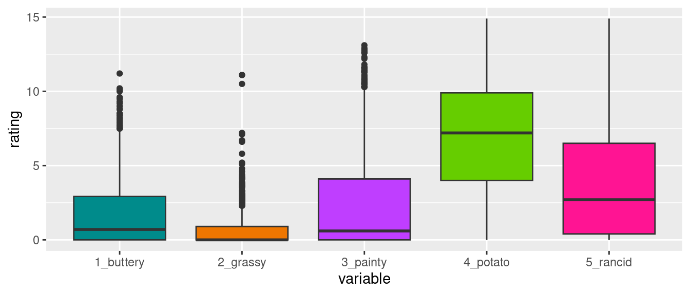
Let’s start with Messy (1)

Use pivot_longer and pivot_wider
Tidy your data using pivot_longer
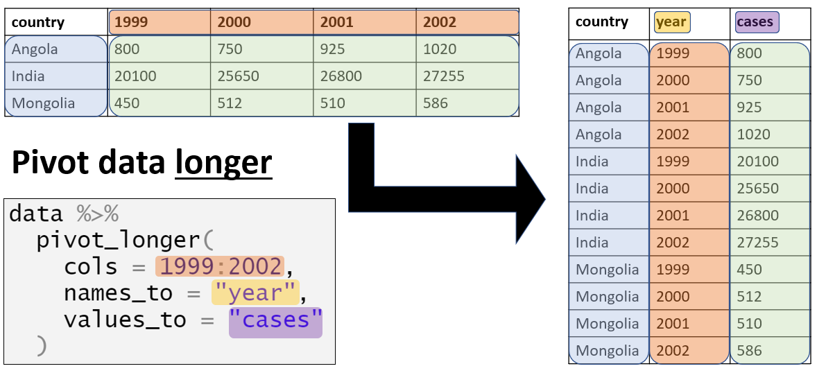
When pivoting longer, you need to specify: - the cols (identifiers) - the names_to (new column name) - the values_to (measures from cols)
pivot_longer Example
| time | treatment | subject | rep | variable | rating |
|---|---|---|---|---|---|
| 1 | 1 | 3 | 1 | potato | 2.9 |
| 1 | 1 | 3 | 1 | buttery | 0.0 |
| 1 | 1 | 3 | 1 | grassy | 0.0 |
| 1 | 1 | 3 | 1 | rancid | 0.0 |
| 1 | 1 | 3 | 1 | painty | 5.5 |
| 1 | 1 | 3 | 2 | potato | 14.0 |
This format is better suited for data analysis
Long to Wide
In certain applications, we may wish to take a long dataset and convert it to a wide dataset (Perhaps displaying in a table).
| time | treatment | subject | rep | variable | rating |
|---|---|---|---|---|---|
| 1 | 1 | 3 | 1 | potato | 2.9 |
| 1 | 1 | 3 | 1 | buttery | 0.0 |
| 1 | 1 | 3 | 1 | grassy | 0.0 |
Tidy your data using pivot_wider
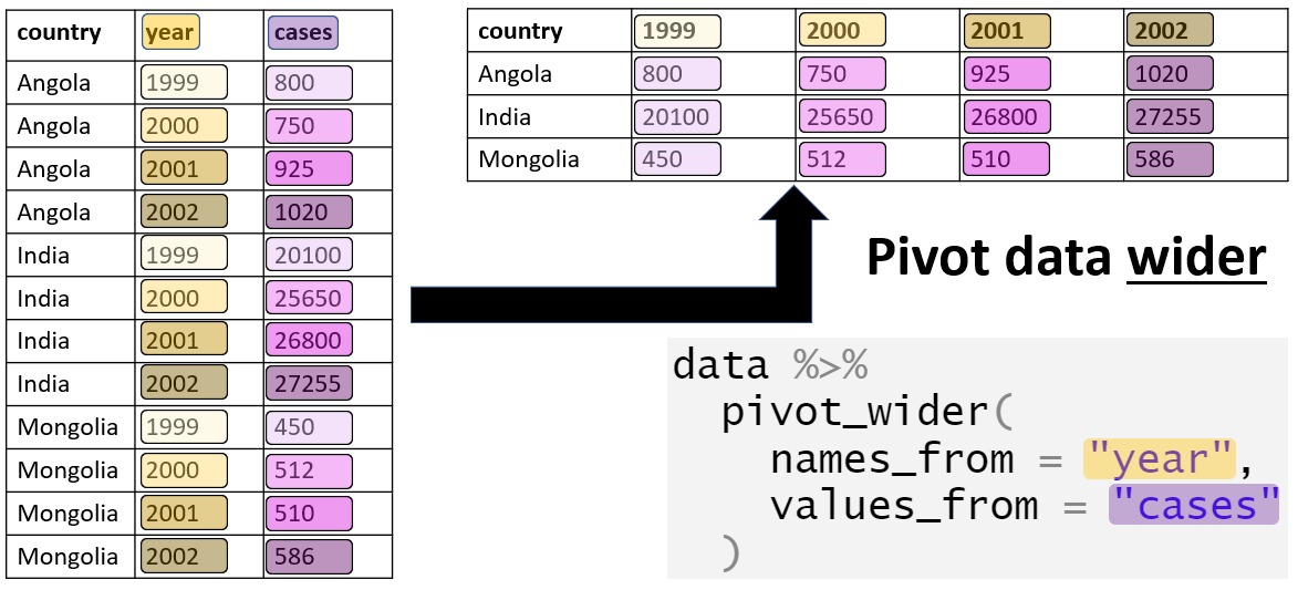
When pivoting wider, you need to specify: - the names_from (column name that we want to widen) - the values_from (measures from column we want to widen)
pivot_wider Example
| time | treatment | subject | rep | potato | buttery | grassy | rancid | painty |
|---|---|---|---|---|---|---|---|---|
| 1 | 1 | 3 | 1 | 2.9 | 0.0 | 0.0 | 0.0 | 5.5 |
| 1 | 1 | 3 | 2 | 14.0 | 0.0 | 0.0 | 1.1 | 0.0 |
| 1 | 1 | 10 | 1 | 11.0 | 6.4 | 0.0 | 0.0 | 0.0 |
| 1 | 1 | 10 | 2 | 9.9 | 5.9 | 2.9 | 2.2 | 0.0 |
We are now back to our original format
pivot_wider (cont.)
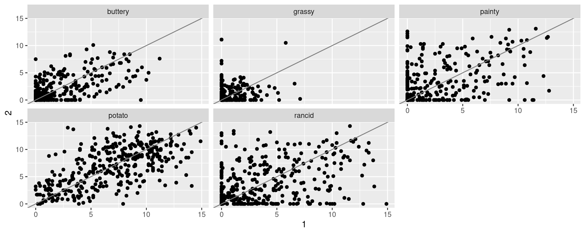
We can also use the pivot_wider function to compare replicates within the French Fry dataset
| time | treatment | subject | variable | 1 | 2 |
|---|---|---|---|---|---|
| 1 | 1 | 3 | potato | 2.9 | 14 |
| 1 | 1 | 3 | buttery | 0.0 | 0 |
| 1 | 1 | 3 | grassy | 0.0 | 0 |
Compare replicates of tested French Fry Data
Motivating Example (separate function)
| states | dates |
|---|---|
| Lincoln/NE | Aug-2000 |
| Chicago/IL | Sep-2001 |
| Ames/IA | Oct-2002 |
| Nashville/TN | Feb-2001 |

Basic Idea: separate
- How do I handle those values in my dataset? Let’s use
separate

separate Example 1
separate Example 2
Your Turn
The Iowa Data Portal is a wealth of information on and about the State of Iowa.
The website Campaign Expenditures provides data on campaign expenditures. The code below reads the data into an R session.
Assess the ‘messiness’ of the data. List issues that prevent us from working with the data directly. Which of these issues are of type (1) or (2) of messiness?
Problems with the data
Dateis text, in the format of Month/Day/Year (Messy 2)city coordinates are a combination of City name, state, zip code and geographic latitude and longitude. (Messy 2)
expenditure amount is a textual expression, not a number (Messy different)
No Messy 1? - problems of type Messy 1 are typically hard to detect and often up to interpretation/dependent on the analysis to be done.

Your Turn
During the 1870 census data on people’s occupation was collected. The data occupation-1870 contains state-level aggregates of occupation by gender.
Use
tidyrto get the data into a long format (usepivot_longer).Separate the
occupation.gendertype variable into two variables.“Spread” (use
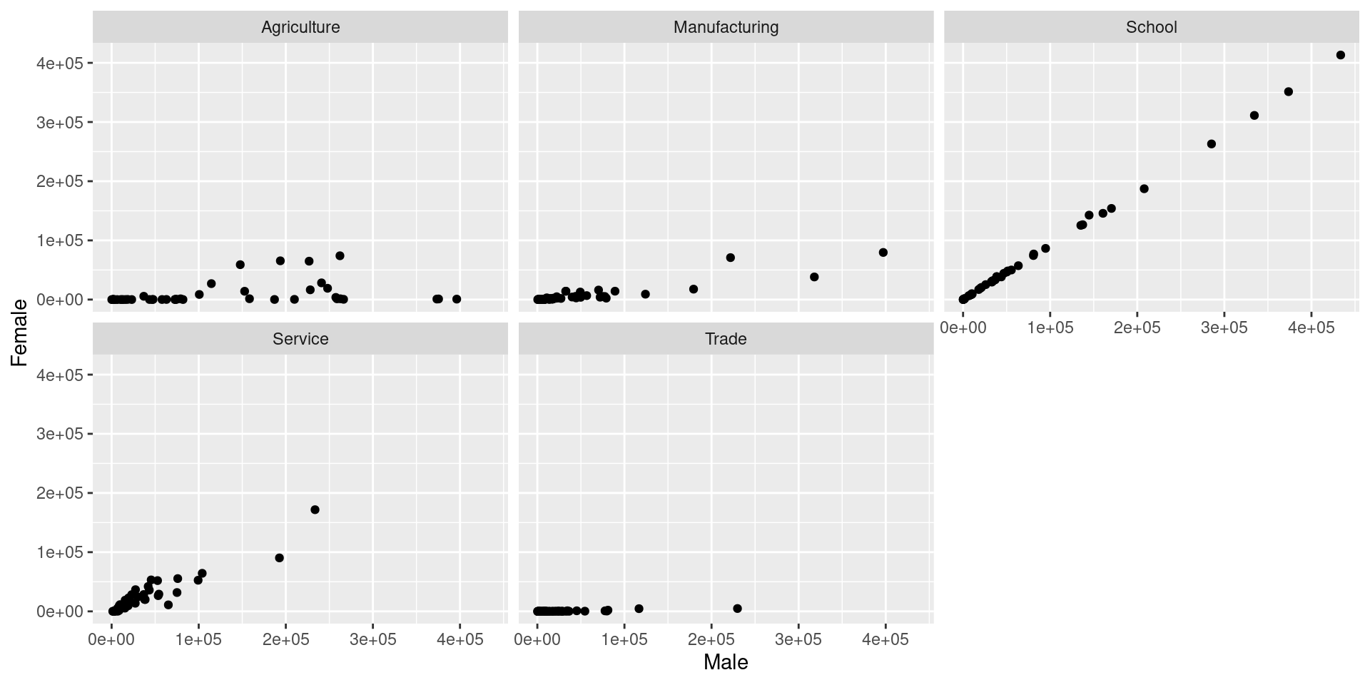
pivot_wider) the data such that you can draw scatterplots of values for men against women facetted by occupation.
Solution
occupation <- read_csv("https://unl-statistics.github.io/R-workshops/r-format/data/occupation-1870.csv")

occupation_long <- occupation %>%
  pivot_longer(Agriculture.Male:School.Female,names_to = "Occupation", values_to = "Measurement") %>%
  separate(Occupation, c("Occupation", "Gender"), sep="\\.") %>%
  pivot_wider(names_from = "Gender", values_from = "Measurement")

head(occupation_long, 10)
# A tibble: 10 × 5
`Area name` Total.Population Occupation Male Female
<chr> <dbl> <chr> <dbl> <dbl>
1 Alabama 996992 Agriculture 226768 64860
2 Alabama 996992 Manufacturing 15078 1992
3 Alabama 996992 Trade 14345 90
4 Alabama 996992 Service 19449 22676
5 Alabama 996992 School 38600 38539
6 Arizona Territory 9658 Agriculture 1284 1
7 Arizona Territory 9658 Manufacturing 883 156
8 Arizona Territory 9658 Trade 588 3
9 Arizona Territory 9658 Service 2979 136
10 Arizona Territory 9658 School 79 70Solution
Dates and Times
Dates are deceptively hard to work with in R.
Example: 02/05/2012. Is it February 5th, or May 2nd?
Other things are difficult too:
- Time zones
- POSIXct format in base R is challenging
The lubridate package helps tackle some of these issues.
Basic Lubridate Use
Parsing Dates
Your Turn
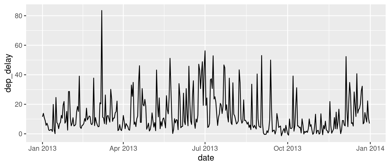
The flights dataset contains information on over 300,000 flights that departed from New York City in the year 2013.
Using the
flightsdata, create a new column Date using lubridate. You will need to paste together the columns year, month, and day in order to do this. See thepastefunction.Use
dplyrto calculate the average departure delay for each date.Plot the date versus the average departure delay
SOLUTION
Your Turn
- Read in the billboard top 100 music data:
Use
tidyrto convert this data into a long format.Use
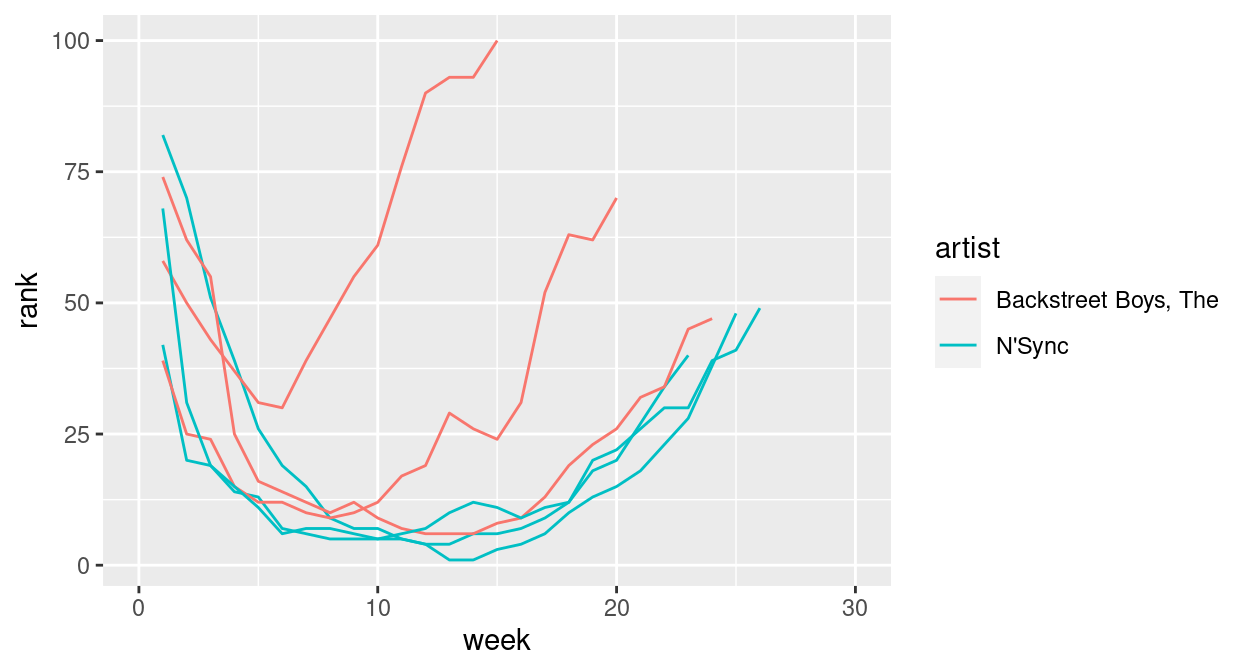
ggplot2to create something like this:
