| Gestalt Hierarchy | Graphs |
|---|---|
| Enclosure | Facets |
| Connection | Lines |
| Proximitiy | White Space |
| Similarity | Color/Shape |
Data Visualization
Using ggplot2
PERCEPTION
Why are some plots easier to read than others?
What makes bad figures bad?
- issues can be (1) aesthetic, (2) substantive, and/or (3) perceptual
Why are some plots easier to read than others?
What makes bad figures bad?
issues can be (1) aesthetic, (2) substantive, and/or (3) perceptual
Edward R. Tufte is a better known critic of this style of visualization
Graphical excellence is the well-designed presentation of interesting data and consists of:
complex ideas communicated with clarity, precision, and efficiency
maximizes the “data-to-ink” ratio.
nearly always multivariate
requires telling the truth about the data.
defines “chartjunk” as superfluous details
Why are some plots easier to read than others?
What makes bad figures bad?
issues can be (1) aesthetic, (2) substantive, and/or (3) perceptual
bad data
Why are some plots easier to read than others?
What makes bad figures bad?
issues can be (1) aesthetic, (2) substantive, and/or (3) perceptual
Looking at pictures of data means looking at lines, shapes, and colors
Our visual system works in a way that makes some things easier for us to see than others
“Preattentive” features
Gestalt Principles
color and contrast
Good Graphics
Graphics consist of:
Structure: boxplot, scatterplot, etc.
Aesthetics: features such as color, shape, and size that map other characteristics to structural features
Both the structure and aesthetics should help viewers interpret the information.
Gestalt Principles
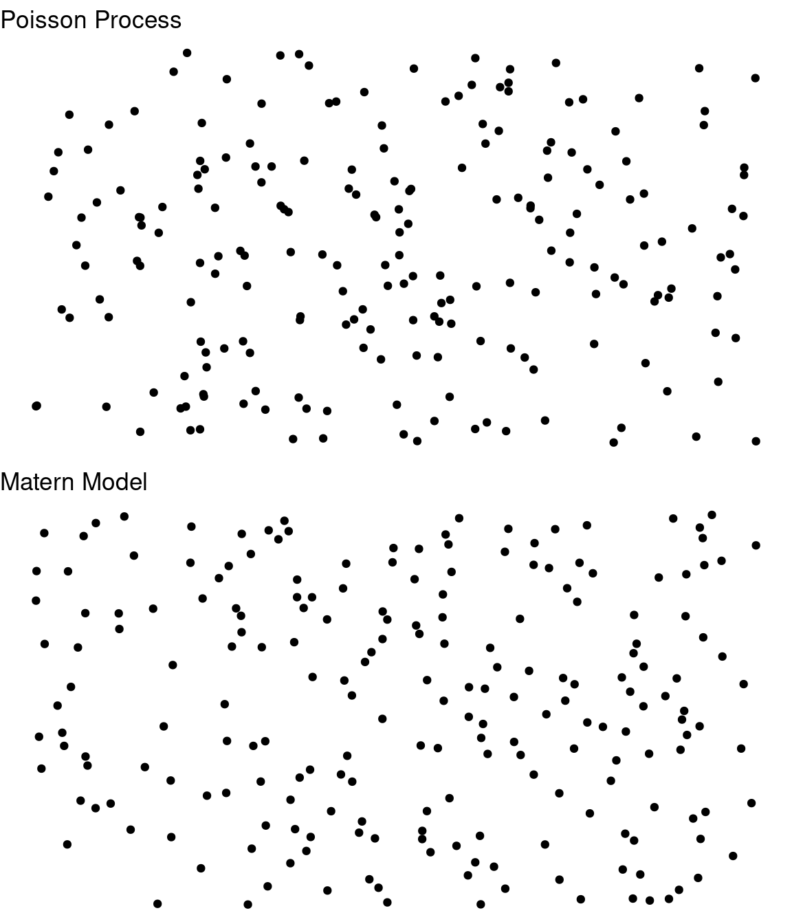
What sorts of relationships are inferred, and under what circumstances?
Which has more structure?
Gestalt principles
Gestalt principles
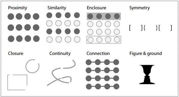
What sorts of relationships are inferred, and under what circumstances?
Proximity: Things that are spatially near to one another are related.
Similarity: Things that look alike are related.
Enlosure: A group of related elements are surrounded with a visual element
Symmetry: If an object is asymmetrical, the viewer will waste time trying to find the problem instead of concentrating on the instruction.
Closure: Incomplete shapes are perceived as complete.
Continuity: Partially hidden objects are completed into familiar shapes.
Connection: Things that are visually tied to one another are related.
Figure/Ground: Visual elements are either in the foreground or the background.
Gestalt principles
Implications for practice + Know how we perceive groups + Know that we perceive some groups before others + Design to facilitate and emphasize the most important comparisons
Gestalt Principles: Case Study
  Location   WaterTemp     Time      AvgTemp
 cheek:6   indoor :12   pre  :8   Min.   :48.60
 elbow:6   outdoor:12   post1:8   1st Qu.:67.67
 palm :6                post2:8   Median :84.25
 pec  :6                          Mean   :78.70
                                  3rd Qu.:89.83
                                  Max.   :95.40
Gestalt Principles: Case Study
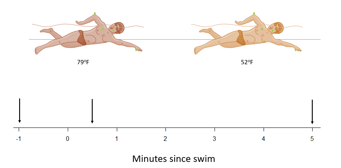
Research question: Does the average body temperature recovery as recorded at the four body points depend on water temperature?

Gestalt Principles: Case Study

Gestalt Principles: Case Study
Research question: Does the average body temperature recovery as recorded at the four body points depend on water temperature?


Pre-Attentive Features
Pre-Attentive Features
Pre-Attentive Features
Pre-Attentive Features
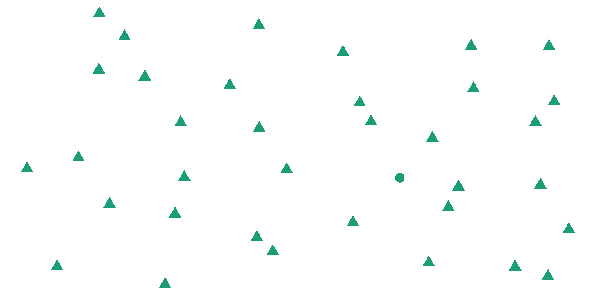
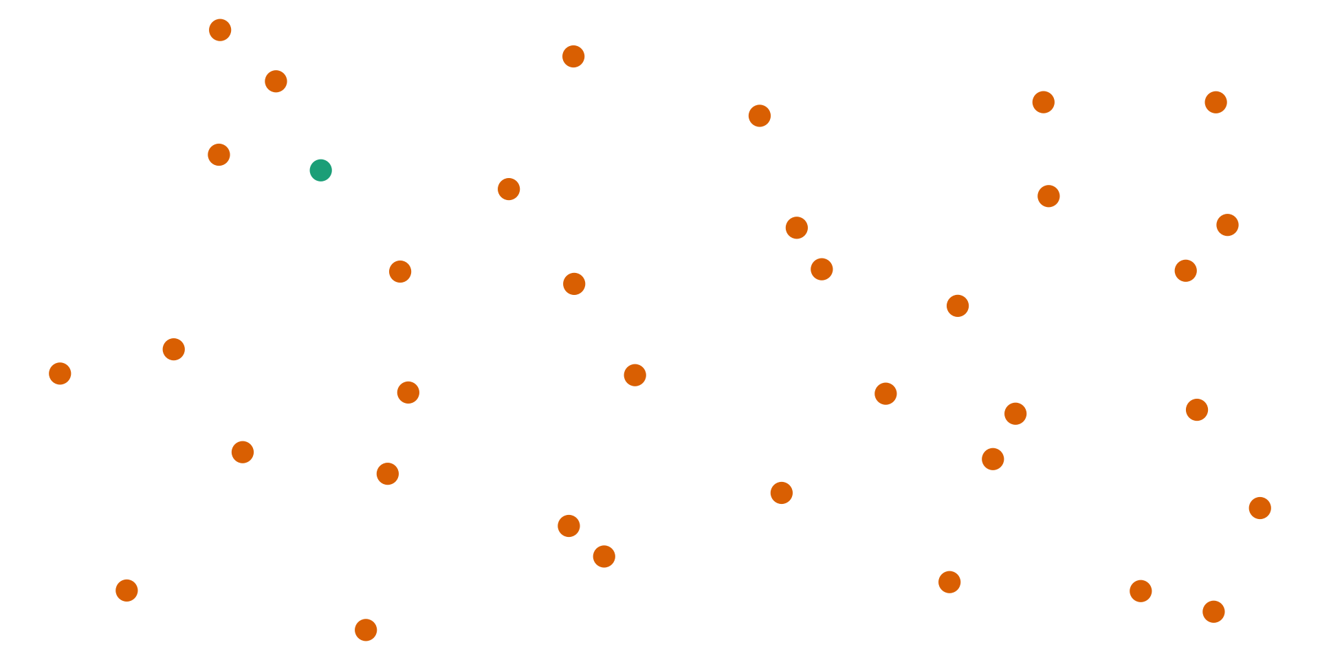
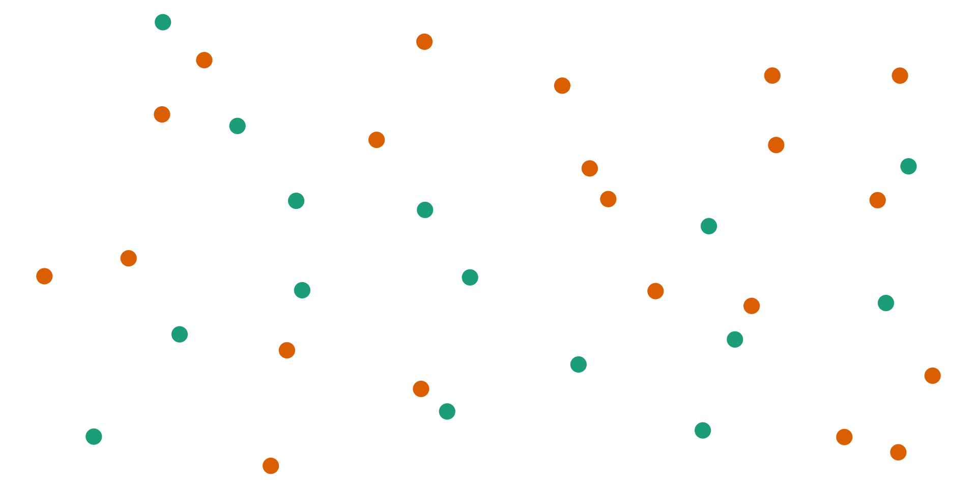
Pre-Attentive Features are things that “jump out” in less than 250 ms
- Color, form, movement, spatial localization
There is a hierarchy of features
Color is stronger than shape
Combinations of pre-attentive features are usually not pre-attentive due to interference
Pre-attentive Features

Pre-attentive Features
Color
Hue: shade of color (red, orange, yellow…)
Intensity: amount of color
Both color and hue are pre-attentive. Bigger contrast corresponds to faster detection.
Use color to your advantage
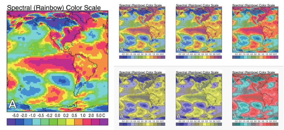
When choosing color schemes, we will want mappings from data to color that are not just numerically but also perceptually uniform
Distinguish between sequential scales and categorical scales
Color
Our eyes are optimized for perceiving the yellow/green region of the color spectrum.
Sensitivity of the human eye to different wavelengths of visual light (Image from Wikimedia commons)
Color blindness
Not everyone perceives color in the same way. Some individuals have colorblindness or color deficiencies.
You can take a test designed to screen for colorblindness here.
Context
Color is context-sensitive: A and B are the same intensity and hue, but appear to be different.
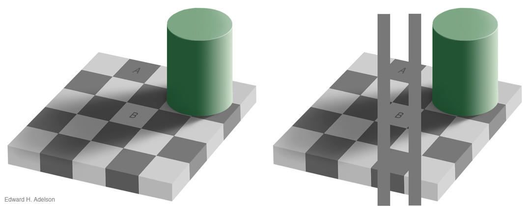
Edward Adelson’s checkershadow illusion
Color: Implications and Guidelines
- To “colorblind-proof” a graphic, you can use a couple of strategies:
- double encoding - where you use color, use another aesthetic (line type, shape)
- If you can print your chart out in black and white and still read it, it will be safe for colorblind users. This is the only foolproof way to do it!
- If you are using a color gradient, use a monochromatic color scheme where possible.
- If you have a bidirectional scale (e.g. showing positive and negative values), the safest scheme to use is purple - white - orange. In any color scale that is multi-hue, it is important to transition through white, instead of from one color to another directly.
Do not use rainbow color gradient schemes.
Avoid any scheme that uses green-yellow-red signaling if you have a target audience that may include colorblind people.
Be conscious of what certain colors “mean”
Ordering Variables
Which is bigger?
- Position: higher is bigger (y), items to the right are bigger (x)
- Size, Area
- Color: not always ordered. More contrast = bigger.
- Shape: Unordered.

Aesthetics in ggplot2
Aesthetics in ggplot2
Aesthetics: features such as color, shape, and size that map other characteristics to structural features
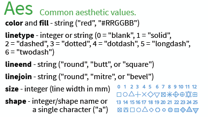
Aesthetics in ggplot2
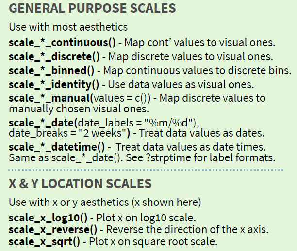
Scales map data values to the visual values of an aesthetic
- to change a mapping, add a new scale

Scales
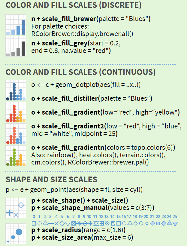
Gradients
Qualitative schemes: no more than 7 colors

Can use colorRampPalette() from the RColorBrewer package to produce larger palettes by interpolating existing ones

Quantitative schemes: use color gradient with only one hue for positive values

More Gradients
Quantitative schemes: use color gradient with two hues for positive and negative values. Gradient should go through a light, neutral color (white)

Small objects or thin lines need more contrast than larger areas
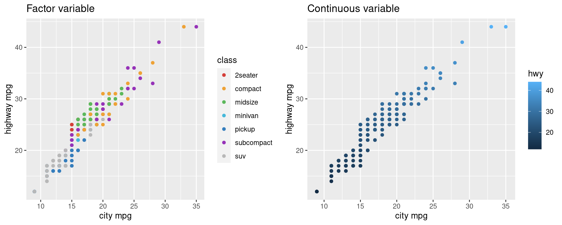
Factors vs. Continuous variables
- Factor variable:
scale_colour_discretescale_colour_brewer(palette = ...)
- Continuous variable:
scale_colour_gradient(define low, high values)scale_colour_gradient2(define low, mid, and high values)- Equivalents for fill:
scale_fill_...
Color in ggplot2
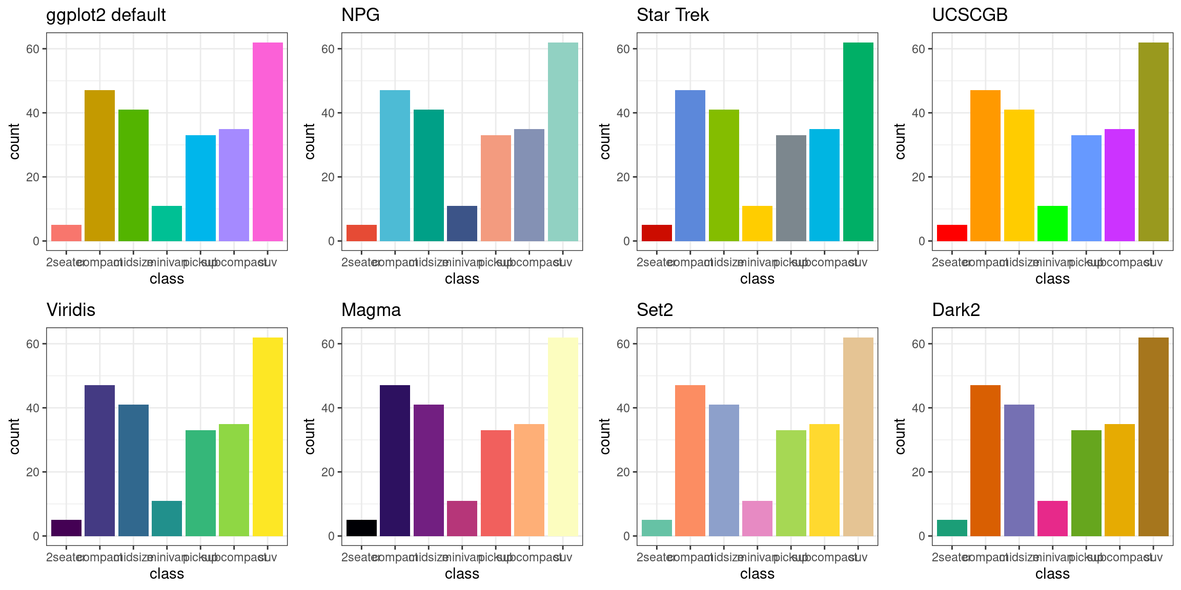
There are packages available for use that have color scheme options.
Some Examples:
- Rcolorbrewer
- ggsci
- viridis
- wes anderson
There are packages such as RColorBrewer and dichromat that have color palettes which are aesthetically pleasing, and, in many cases, colorblind friendly.
You can also take a look at other ways to find nice color palettes.
Color in ggplot2
- There are packages available for use that have color schemes options.
Your Turn
In the
diamondsdata,clarityandcutare ordinal, whilepriceandcaratare continuous.Create a graphic that gives an overview of these four variables while respecting their types.
Discuss your graphic with a neighbor.
Your Turn
The movies data set contains information from IMDB.com including ratings, genre, length in minutes, and year of release.
Explore the differences in length, rating, etc. in movie genres over time.
Hint: use faceting!
Discuss your graphic with a neighbor.