Motivating Example
Motivating Example
Kick off the workshop by exploring a real data set using R!
Goal: get the flavor of using R for data management and exploration
Don’t worry about understanding all the coding right away
We will go back and explain how it all works in detail
Follow along using 2-MotivatingExample.R
Tip: Using “#” in your R File to take notes
- Super important to document your code!
Getting Started
Let’s begin by installing and loading tidyverse:
This workshop will focus largely on a group of packages that live together under the name tidyverse.
tidyverse includes the following well known packages:
ggplot2dplyrtidyrreadr- and more!
Salmonella Shedding Data
Fecal Salmonella shedding recorded over the course of 21 days
Several variables were recorded for each pig at certain time points:
- Amount of Salmonella in feces (log10)
- Pig weight (kg)
- Dietary treatment group
Primary Question: Do the different dietary treatments affect Salmonella shedding?
First look at data in R
Let’s use R to look at the top few rows of the Salmonella shedding data set. First, we load the data set using read_csv:
Now, we use the head function to look at the first 6 rows of the data:
# A tibble: 6 × 12
  pignum time_point pig_weight  temp pan_wt wet_wt Dry_wt_pan Dry_weight
   <dbl>      <dbl>      <dbl> <dbl>  <dbl>  <dbl>      <dbl>      <dbl>
1     77          2         NA  103.   1.02   1.09       1.31       0.29
2     87          2         NA  104.   1.04   1.02       1.33       0.29
3    122          2         NA  104.   1.02   0.99       1.11       0.09
4    160          2         NA  104.   1.09   1          1.36       0.27
5    191          2         NA  104.   1.03   1.02       1.27       0.24
6    224          2         NA  103    1.08   1          1.39       0.31
# ℹ 4 more variables: percent_drymatter <dbl>, daily_shedding <dbl>,
#   treatment <chr>, total_shedding <dbl>
Salmonella Shedding Data: Attributes
How big is this data set, and what types of variables are in each column?
spc_tbl_ [295 × 12] (S3: spec_tbl_df/tbl_df/tbl/data.frame)
 $ pignum           : num [1:295] 77 87 122 160 191 224 337 345 419 458 ...
 $ time_point       : num [1:295] 2 2 2 2 2 2 2 2 2 2 ...
 $ pig_weight       : num [1:295] NA NA NA NA NA NA NA NA NA NA ...
 $ temp             : num [1:295] 103 104 104 104 104 ...
 $ pan_wt           : num [1:295] 1.02 1.04 1.02 1.09 1.03 1.08 1.03 1.09 1.07 1.04 ...
 $ wet_wt           : num [1:295] 1.09 1.02 0.99 1 1.02 1 1.02 0.99 1.07 1.06 ...
 $ Dry_wt_pan       : num [1:295] 1.31 1.33 1.11 1.36 1.27 1.39 1.3 1.24 1.38 1.26 ...
 $ Dry_weight       : num [1:295] 0.29 0.29 0.09 0.27 0.24 0.31 0.27 0.15 0.31 0.22 ...
 $ percent_drymatter: num [1:295] 26.61 28.43 9.09 27 23.53 ...
 $ daily_shedding   : num [1:295] 5.3 5.7 13.22 6.75 5.86 ...
 $ treatment        : chr [1:295] "control" "control" "control" "control" ...
 $ total_shedding   : num [1:295] 2.3 2.48 5.74 2.93 2.54 ...
 - attr(*, "spec")=
  .. cols(
  ..   pignum = col_double(),
  ..   time_point = col_double(),
  ..   pig_weight = col_double(),
  ..   temp = col_double(),
  ..   pan_wt = col_double(),
  ..   wet_wt = col_double(),
  ..   Dry_wt_pan = col_double(),
  ..   Dry_weight = col_double(),
  ..   percent_drymatter = col_double(),
  ..   daily_shedding = col_double(),
  ..   treatment = col_character(),
  ..   total_shedding = col_double()
  .. )
 - attr(*, "problems")=<externalptr>
Salmonella Shedding: Variables
Let’s get a summary of the values for each variable:
     pignum        time_point     pig_weight         temp           pan_wt
 Min.   :  6.0   Min.   : 0.0   Min.   : 9.48   Min.   :101.2   Min.   :1.000
 1st Qu.:119.0   1st Qu.: 2.0   1st Qu.:16.02   1st Qu.:102.4   1st Qu.:1.030
 Median :224.0   Median : 7.0   Median :19.78   Median :102.9   Median :1.050
 Mean   :234.7   Mean   : 8.8   Mean   :21.01   Mean   :102.9   Mean   :1.054
 3rd Qu.:361.0   3rd Qu.:14.0   3rd Qu.:25.29   3rd Qu.:103.4   3rd Qu.:1.070
 Max.   :472.0   Max.   :21.0   Max.   :36.30   Max.   :105.2   Max.   :1.120
                                NA's   :59      NA's   :118     NA's   :122
     wet_wt        Dry_wt_pan      Dry_weight    percent_drymatter
 Min.   :0.700   Min.   :1.110   Min.   :0.090   Min.   : 9.091
 1st Qu.:1.000   1st Qu.:1.300   1st Qu.:0.250   1st Qu.:24.292
 Median :1.020   Median :1.320   Median :0.280   Median :26.923
 Mean   :1.026   Mean   :1.322   Mean   :0.268   Mean   :26.109
 3rd Qu.:1.050   3rd Qu.:1.353   3rd Qu.:0.290   3rd Qu.:28.431
 Max.   :1.110   Max.   :1.460   Max.   :0.380   Max.   :36.893
 NA's   :123     NA's   :123     NA's   :123     NA's   :123
 daily_shedding    treatment         total_shedding
 Min.   : 0.000   Length:295         Min.   : 0.000
 1st Qu.: 0.000   Class :character   1st Qu.: 1.699
 Median : 3.912   Mode  :character   Median :13.904
 Mean   : 3.765                      Mean   :17.423
 3rd Qu.: 5.521                      3rd Qu.:30.893
 Max.   :13.218                      Max.   :66.207
Scatterplots
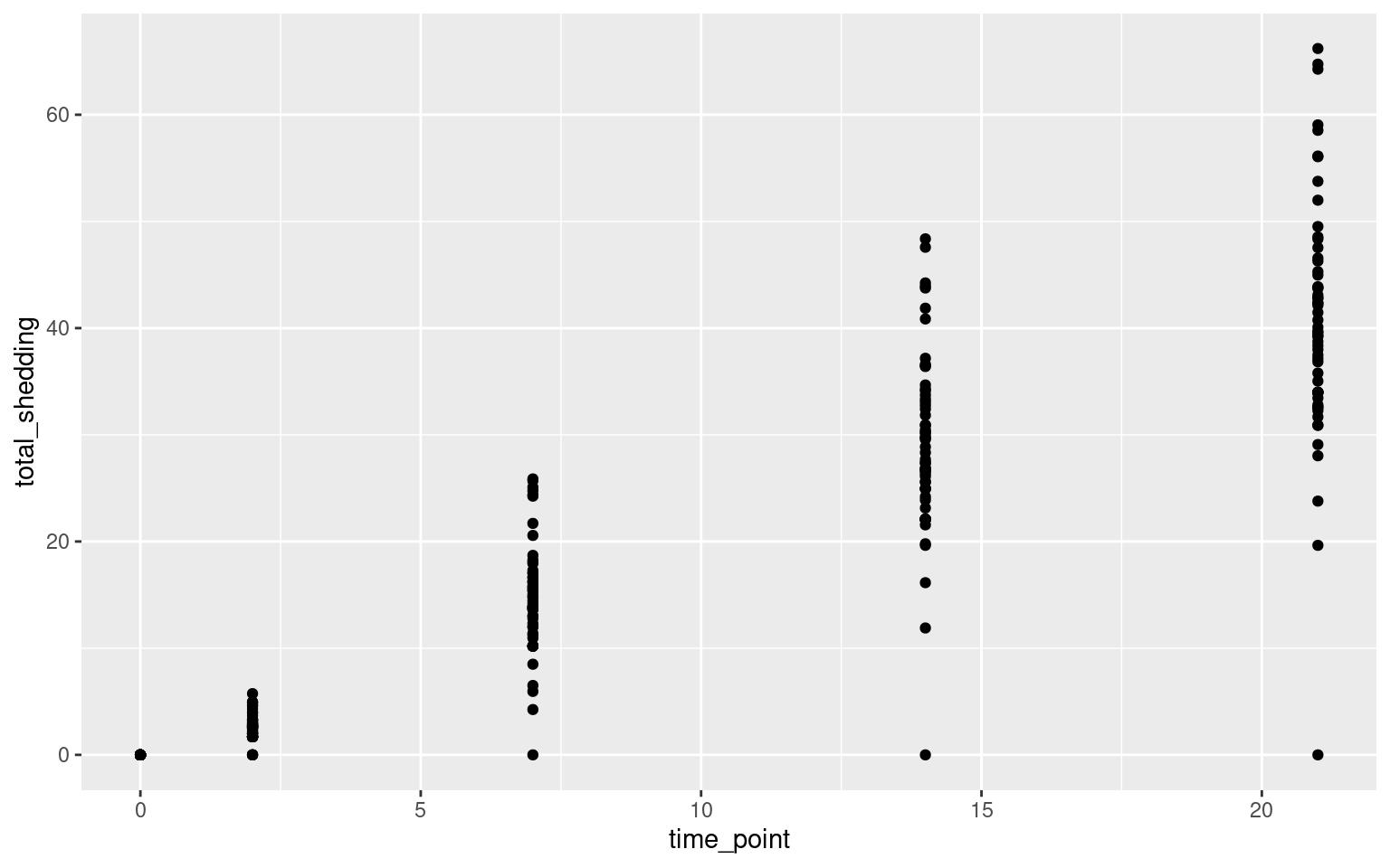
Let’s look at the relationship between time point and Salmonella shedding.
More Scatterplots
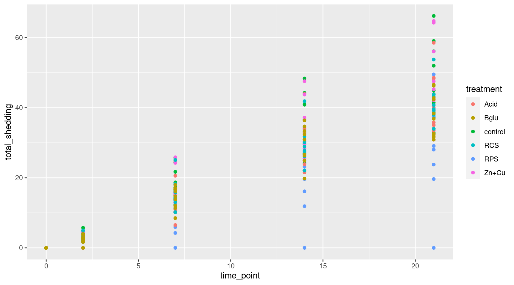
Color the points by treatment groups
More Scatterplots
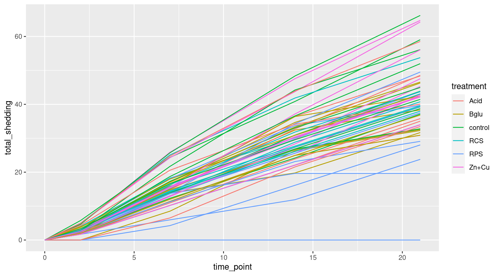
Switch to lines for easier reading
Even More Plots
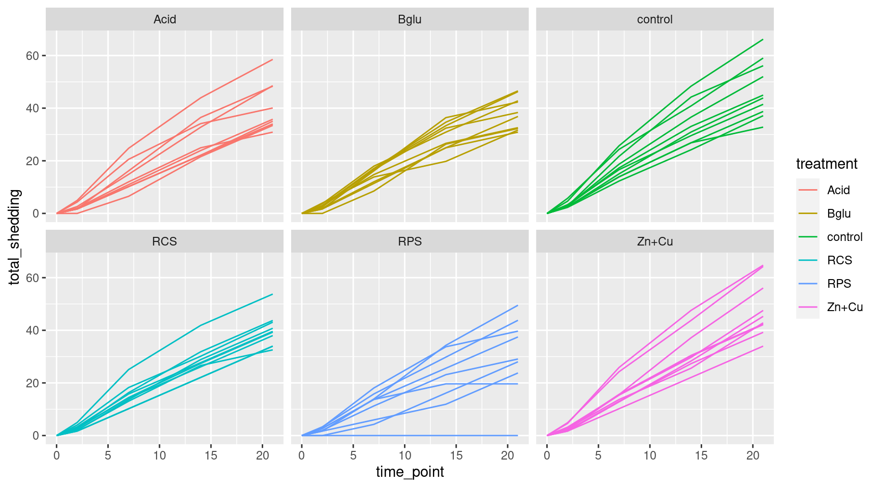
Add faceting
Variable Creation and Data Filtering
We will make a new variable in the data: gain = weight at day 21 - weight at day 0.
We will then filter the data to only include the final values.
Histogram
Let’s look distribution of the final shedding values with a histogram
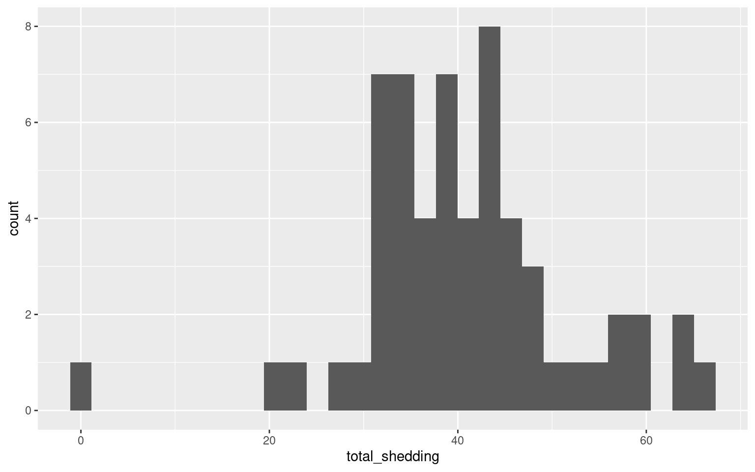
One pig did not shed at all…
Which pig, and what treatment did it receive?
Shedding by Treatment
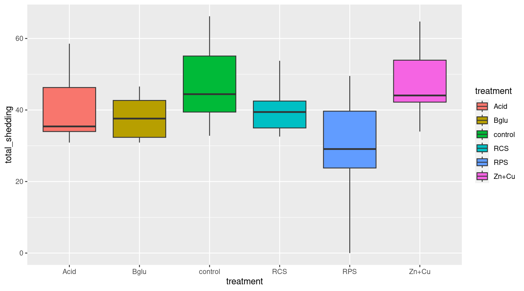
Look at the average cumulative shedding value for each treatment separately
Statistical Significance
There is a difference, but is it statistically significant?
Boxplots
We could compare the cumulative shedding values of each treatment group with a side by side boxplot
Boxplots Again
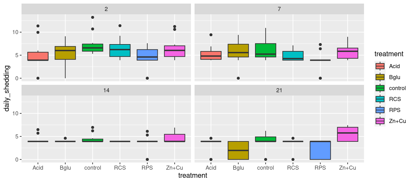
Alternatively, we could use the original data to compare the daily shedding values of each treatment group with side by side boxplots over time
Your Turn
Try playing with chunks of code from this session to further investigate the Salmonella shedding data:
Get a summary of the daily shedding values (use the
sheddata set)Make side by side boxplots of final weight gain by treatment group (use the
final_sheddata set)Compute a Wilcox test for control vs. the “Bglu” treatment group