Data Wrangling
We read…
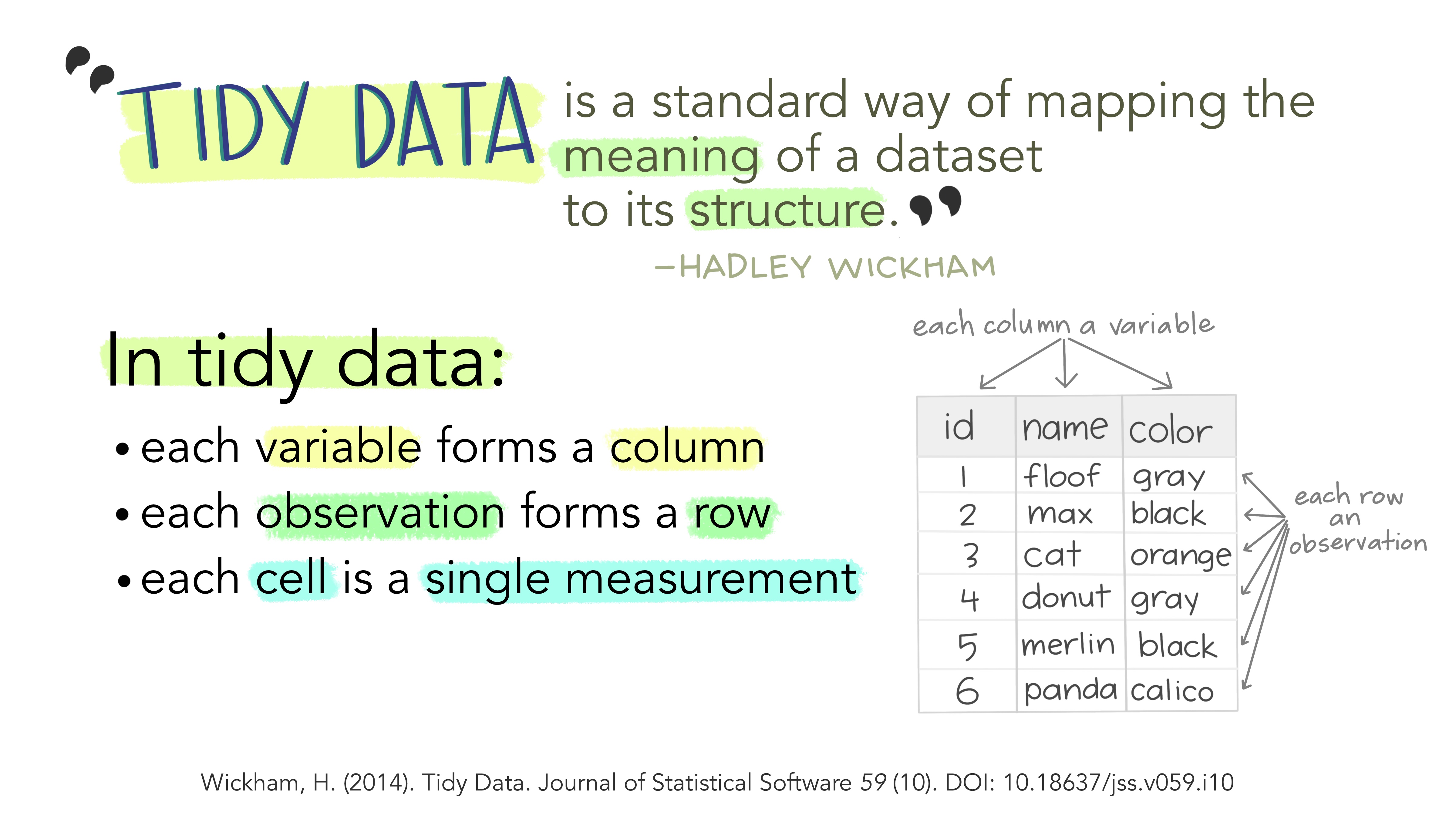
Tidy Data
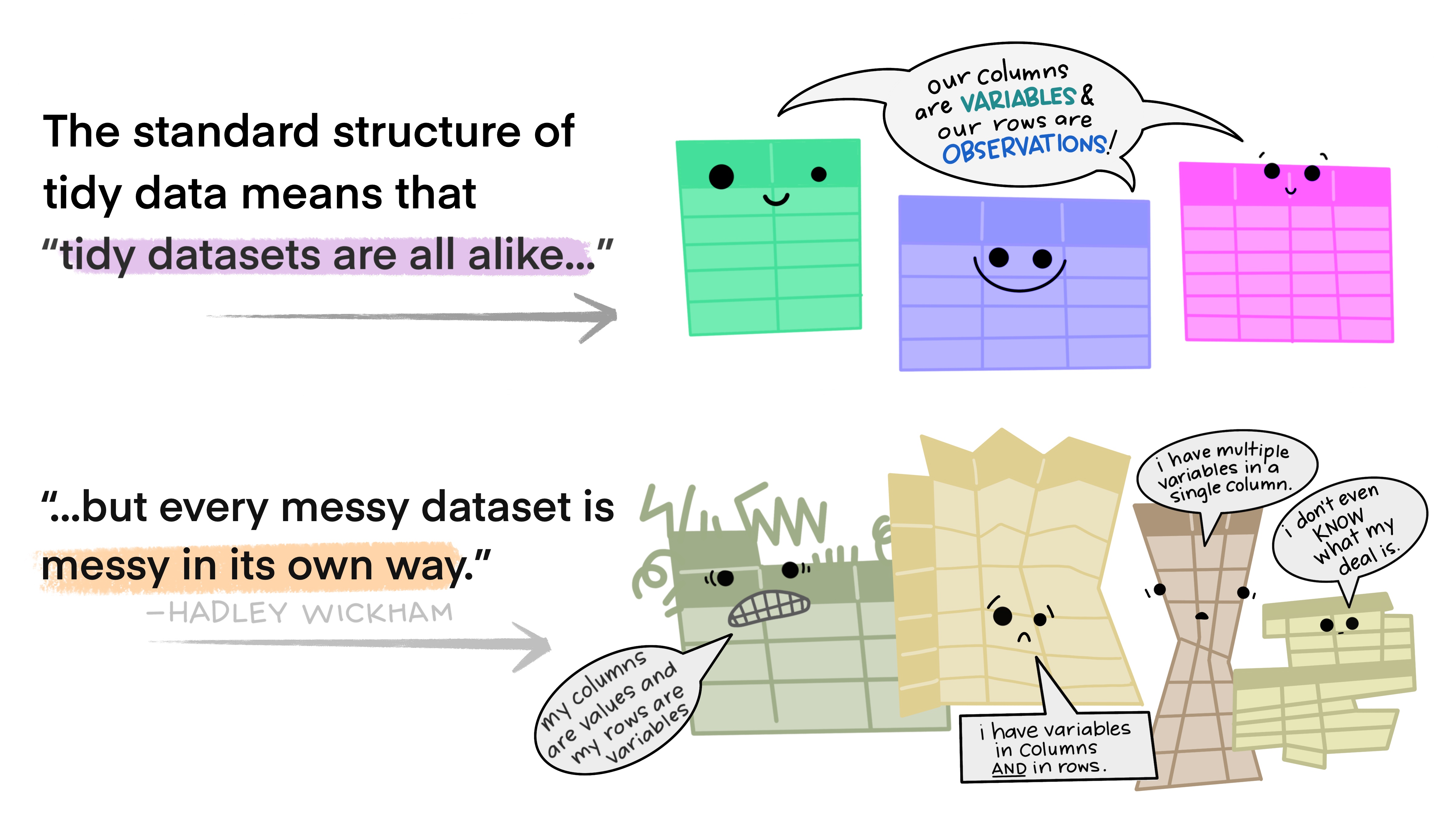
Messy Data
Common Data Cleaning Tasks
- Pick out rows:
- R:
df |> filter(...)or - Python:
df.query(...) ...replaced by a logical condition involving a variable- keep only rows where that condition is true
- R:
- Create new variables:
- R:
df |> mutate(newvar= XXX(...))or - Python:
df['newvar']=df.XXX(...) - XXX may be
transform,replace, or another function ...provides arguments to the function
- R:
- Group by + summarize:
- R:
df |> group_by(varname) |> summarize(newvar = XXX(...))or - Python:
dfsum = df.groupby(varname).agg({newvar:XXX}) .aggsyntax can be tricky. Don’t be afraid to google for help!
- R:
Homework
Replicate a graph in R and a graph in python
Hard part – DO NOT SPEED THROUGH!! – Figure out what form your data needs to be in. Sketch on paper!
New part – clean the data to get it into that form
Easy part – make the chart
Example
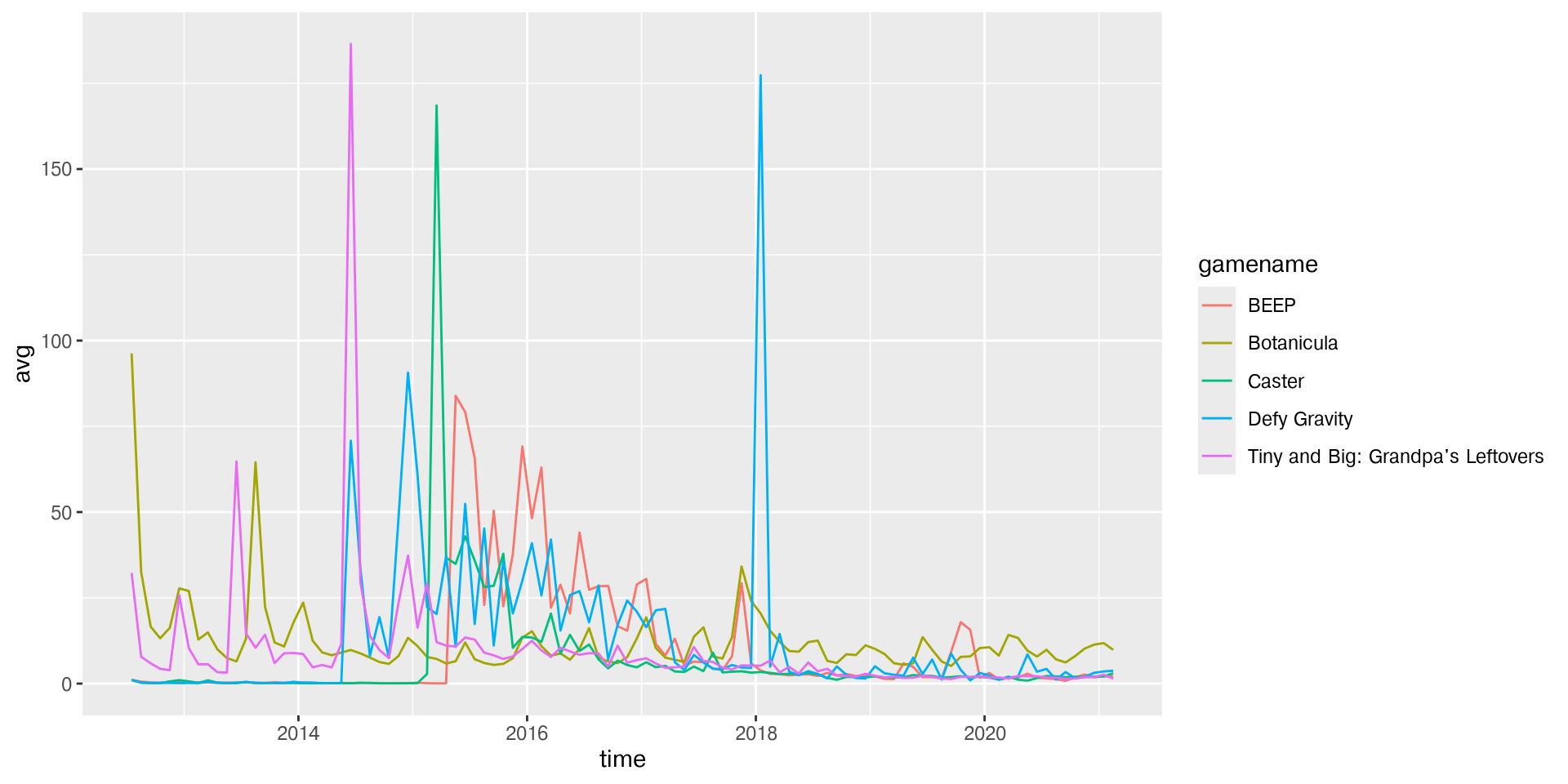
Consider this plot of five games with at least 100 months of data that have the lowest average number of players at the same time.
Example
What steps do we need to perform?
Example
Plot x = time, y = avg for the 5 games identified.
Steps:
Compute average number of players for each game over all available data
group_by(game) |> summarize(avg = mean(avg))Compute months of data
group_by(game) |> summarize(n = n(), avg = mean(avg))Keep only rows with 100 months of data
filter(n>=100)Sort (increasing by average) to get lowest 5 games
arrange(avg) |> filter(row_number() <= 5)Save the names of those 5 games and use to filter main dataset
games |> filter(gamename %in% my_games)Convert month to a number (1-12)
games |> mutate(monthnum = factor(month, levels = month.name, ordered = T) |> as.numeric())Take numerical month and use it to compute time as year + fractional year
games |> mutate(time = year + (month-0.5)/12)