Reshaping Data

Reading and Resources

Creating Data Sketches

A table of country, year, cases, and population. There are two entries for each country, for 1999 and 2000. 
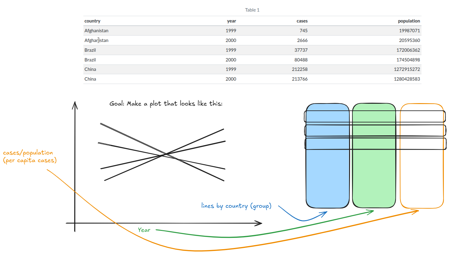
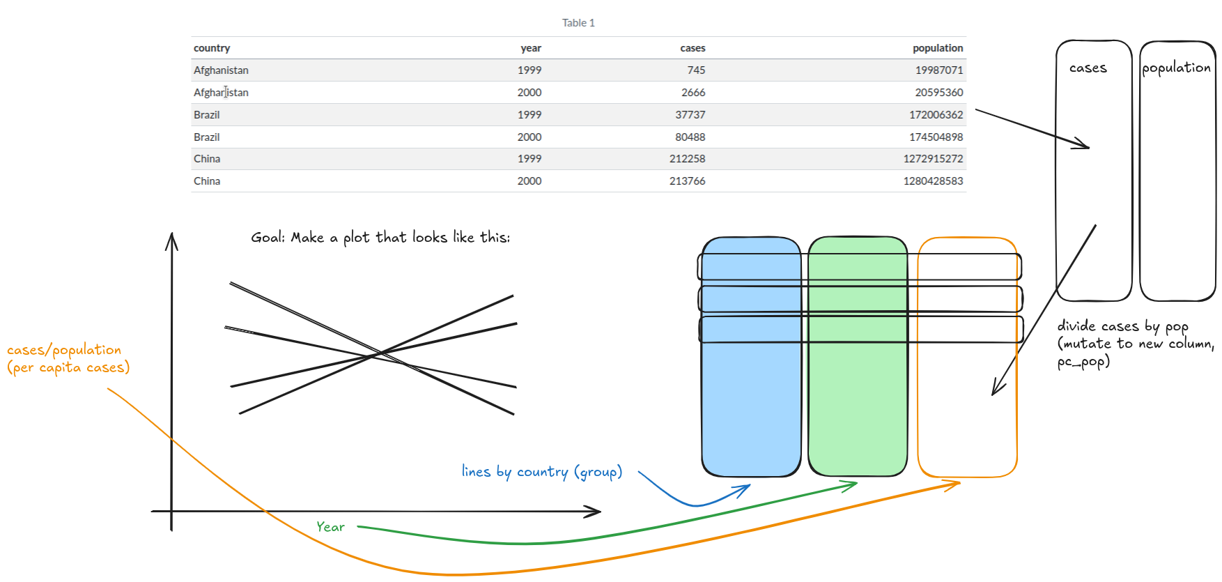
Create a plot of per capita cases by year for each country

Creating Data Sketches

A sketch of a chart containing per capita cases by year for each country. The y-axis is labeled cases/population (per capita cases), the x-axis is labeled year, and there are several straight lines with the label 'lines by country (group)'. From this plot sketch, the ggplot2 aesthetics can be easily determined and comparing the variables to the data avilable determines the path forward

Creating Data Sketches

A sketch of a general data table is added to the canvas, showing a 3-col data table, with a country column, a year column, and a per capita cases column. Rows are indicated as being unique to a combination of year and country.

Creating Data Sketches

Finally, a sketch of two columns, cases and population, is added, and an arrow connects the table we have to the new sketched table, indicating that cases should be divided by population to create a new column, pc_cases.

Homework 11

  • Use github classroom to accept the assignment
  • Don’t forget to commit and push your changes!
    • You don’t have to wait until the assignment is complete to push!
    • Push early and often!

Hints and Clarifications

  • Draw your data structures before you start writing code!!

    • What columns do you need? (generally – you don’t have to list them all)
    • What row identifiers should be there?
    • What observations are in each cell?
  • Think in steps: how do you get from what you have to what you want?

  • At the end… think critically about the data. Does it look like you’d expect?

Coming Up

  • Next week: Creating good (and bad) charts

  • Last week of classes:

    • Homework resubmission deadline is May 5th
    • In Class Exam Review - May 7th
      • Work through practice exam together
    • Final Exam - May 15th, 1-3 pm, Hardin 163