Creating Good Graphics
2026-02-19
Homework rubric
Variable active
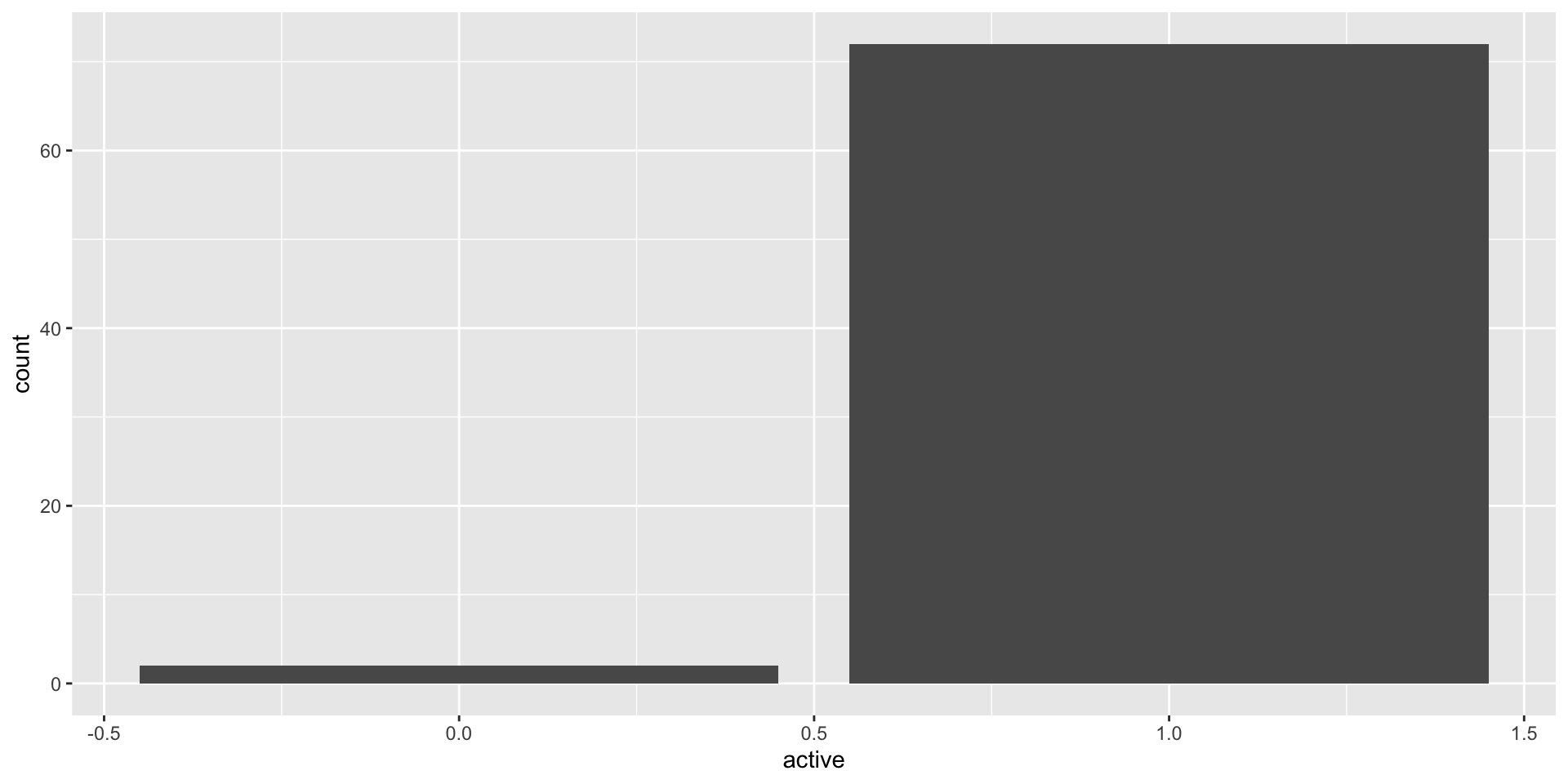
This is a barchart of the variable active, the variable is mapped to the x axis, the count for each bar (corresponding to the height of the bars) is mapped to y. Finding: Very few (2) groundhogs are not active.
Do different groundhogs have different probabilities of predicting 6 more weeks of winter?
predictions <- read.csv("https://raw.githubusercontent.com/stat-assignments/eda-groundhogs/refs/heads/main/groundhog-predictions.csv")

predictions %>%
  mutate(name = reorder(factor(name), name, length)) %>%
  ggplot(aes(x = name)) + geom_bar() +
  geom_bar(aes( weight = shadow), fill = "darkorange") +
  theme(axis.text.x = element_text(angle = 60, hjust = 1)) +
  ggtitle("Number of predictions\nNumber of times seeing a shadow in orange")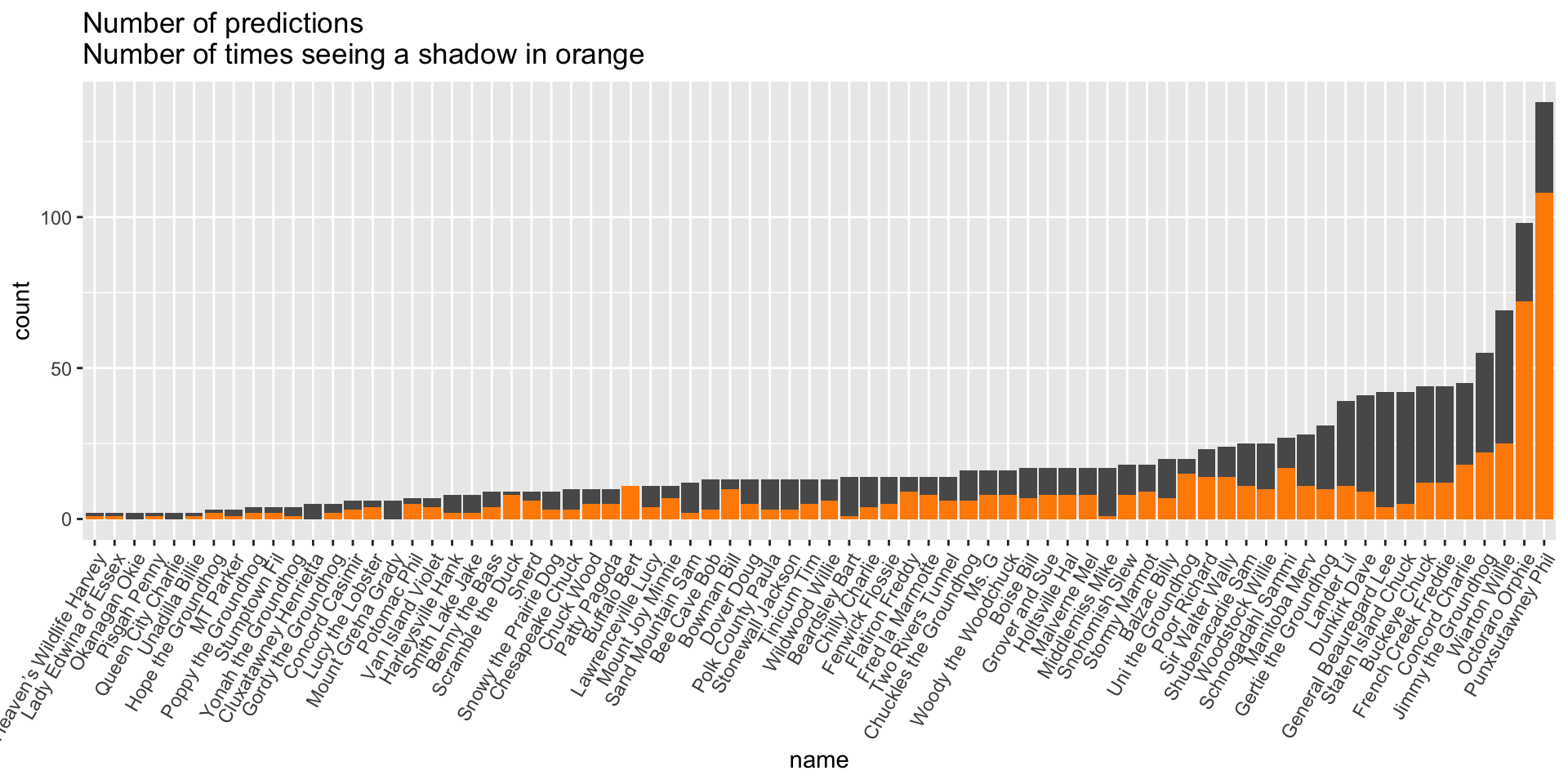
What about missing values in the shadow variable?
How do we need to change the previous chart?
predictions <- read.csv("https://raw.githubusercontent.com/stat-assignments/eda-groundhogs/refs/heads/main/groundhog-predictions.csv")

predictions %>%
  filter(!is.na(shadow)) %>%
  mutate(name = reorder(factor(name), name, length)) %>%
  ggplot(aes(x = name)) + geom_bar(aes(fill=factor(shadow)), position = "fill") +
theme(axis.text.x = element_text(angle = 60, hjust = 1)) 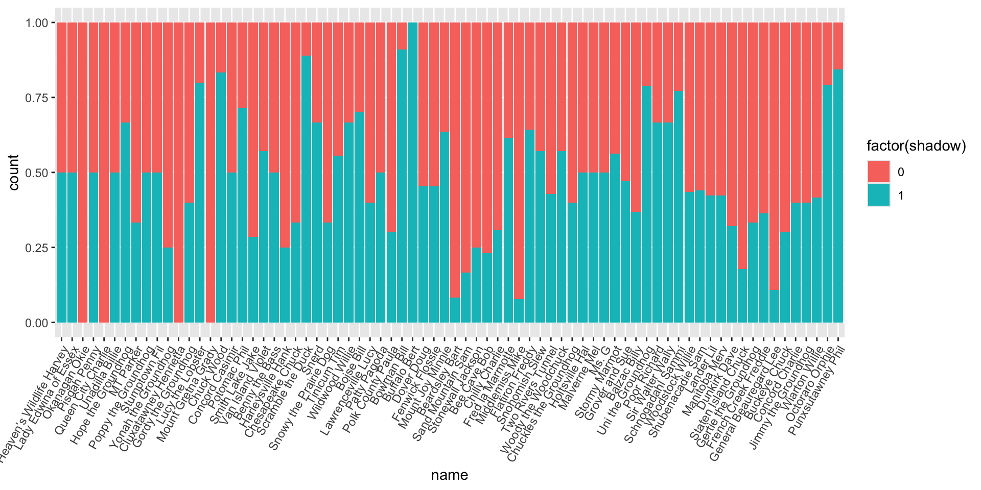
limitations: different groundhogs have made very different number of predictions (and for different years)
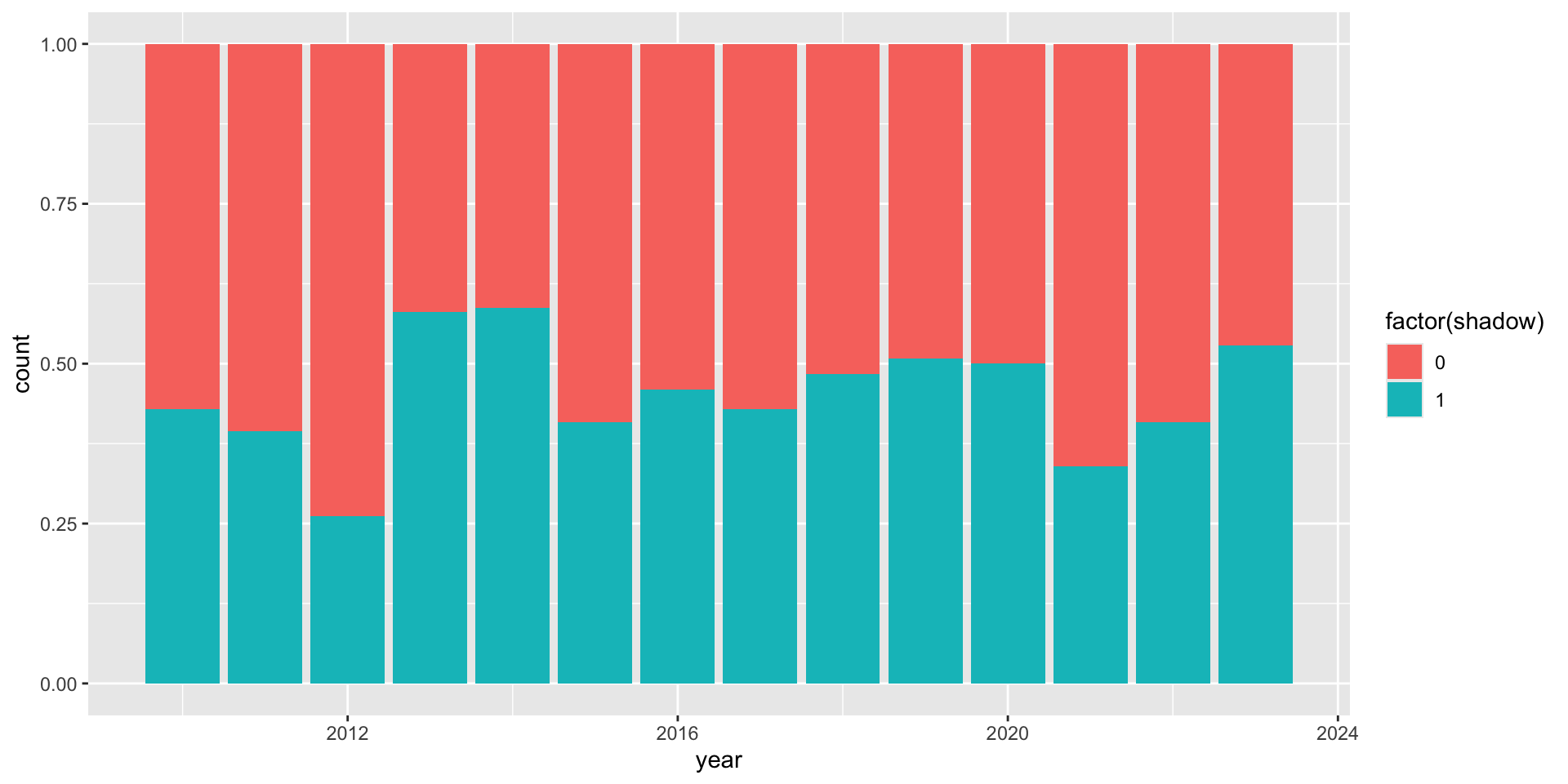
How much do North American groundhogs tend to agree on their predictions?

For years since 2010 … in each year close to 50/50 shadow/noshadow prediction - that’s the least amount of agreement we can possibly get!
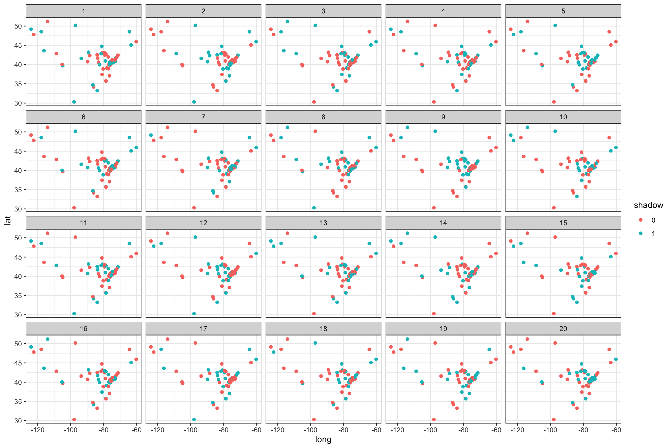
But … when we color points by prediction, there seems to be regional agreement
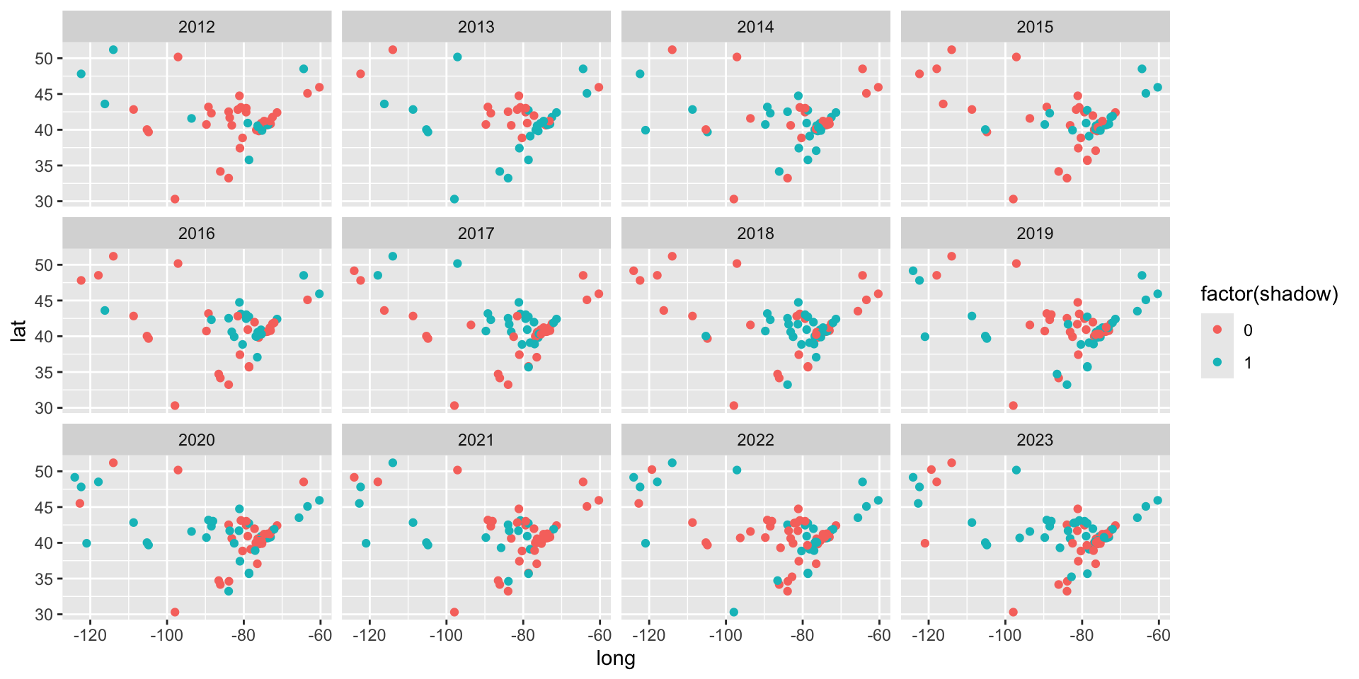
Is this perceived agreement real?
Which plot shows the most geographic agreement?
