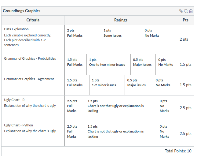
This is a barchart of the variable active, the variable is mapped to the x axis, the count for each bar (corresponding to the height of the bars) is mapped to y. Finding: Very few (2) groundhogs are not active.
Probabilities and Agreement
Answer the following two questions using charts. Explain your chart, and explain how it answers the question.
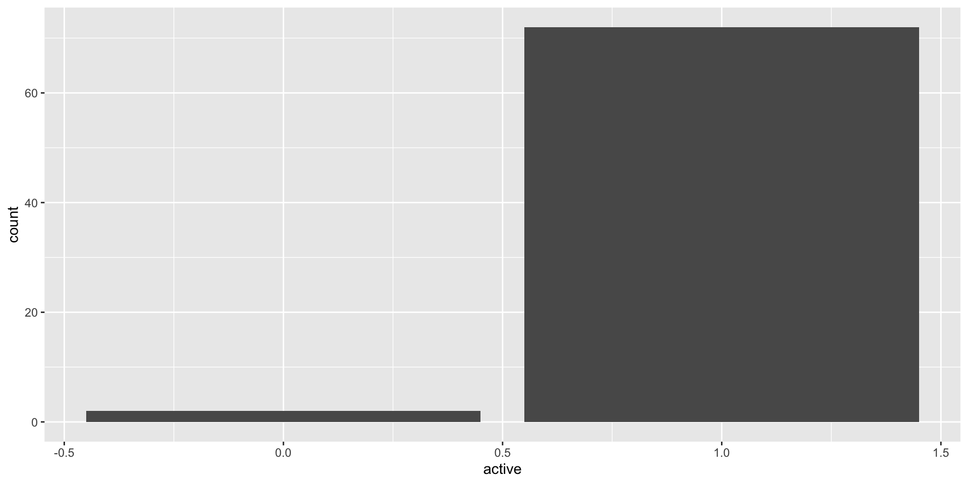
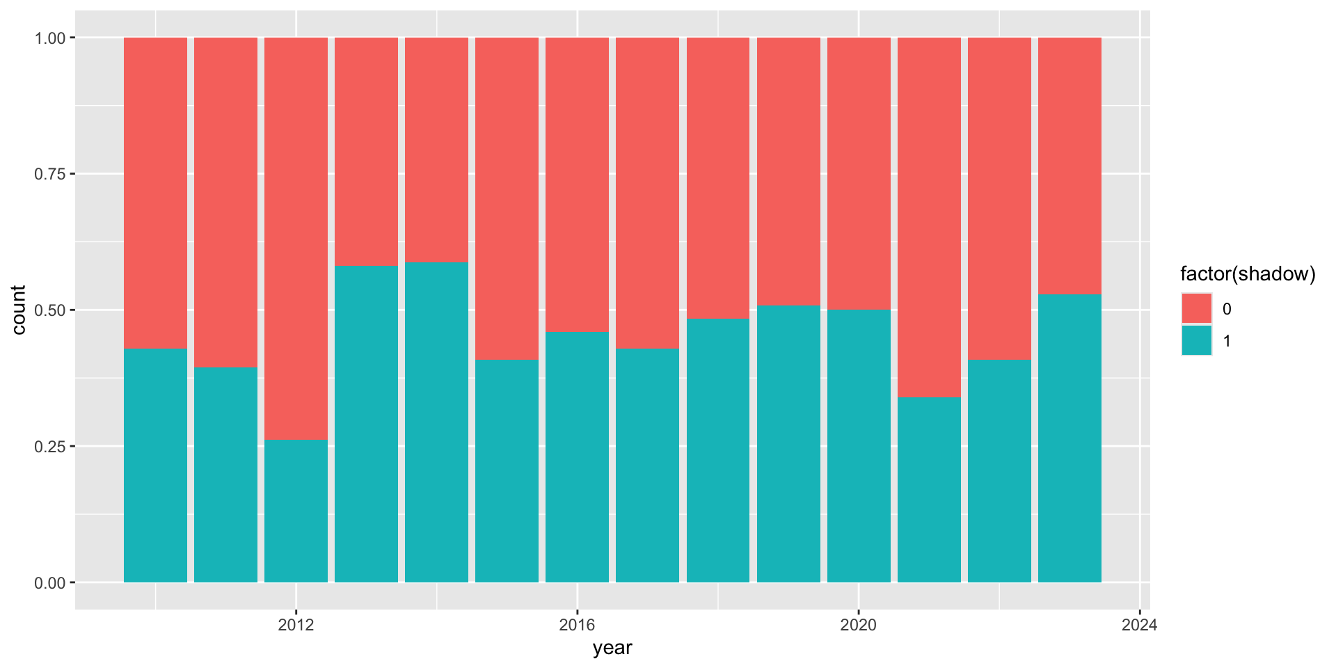
Do different groundhogs have different probabilities of predicting 6 more weeks of winter?
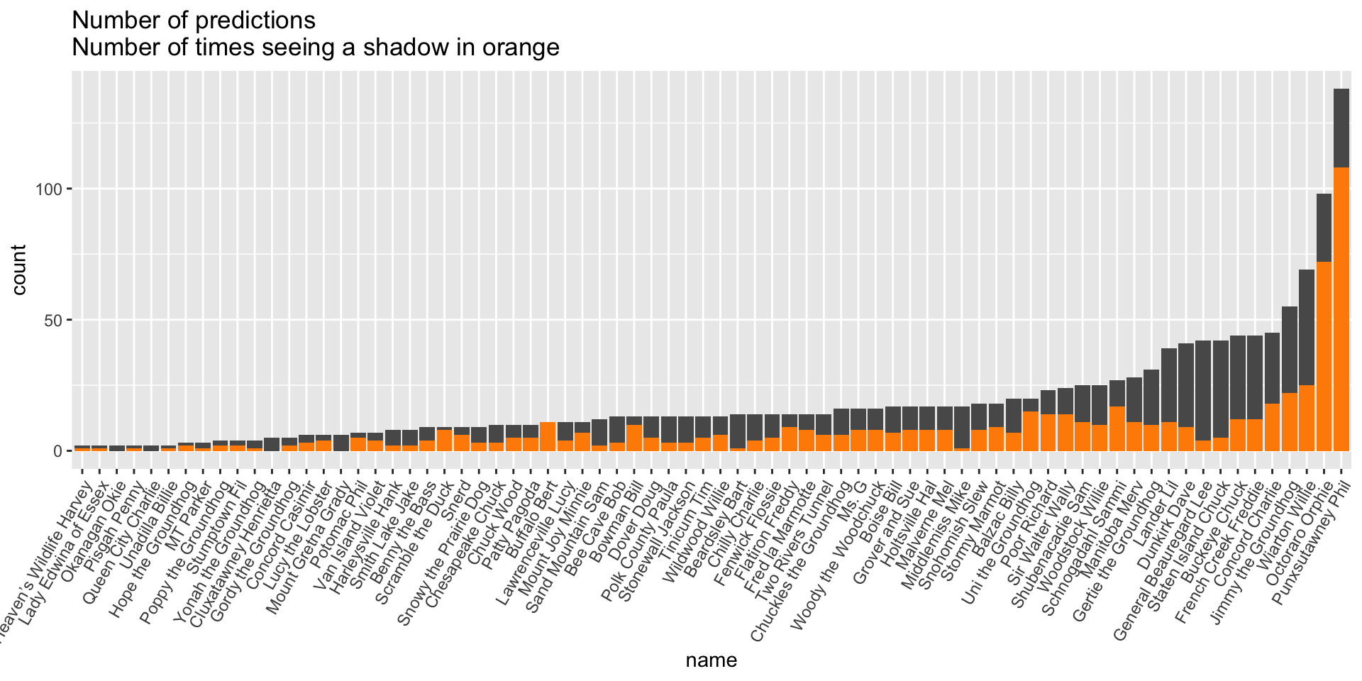
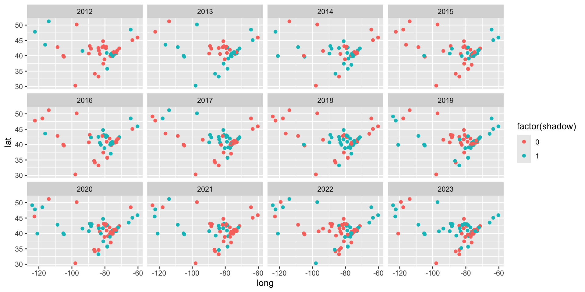
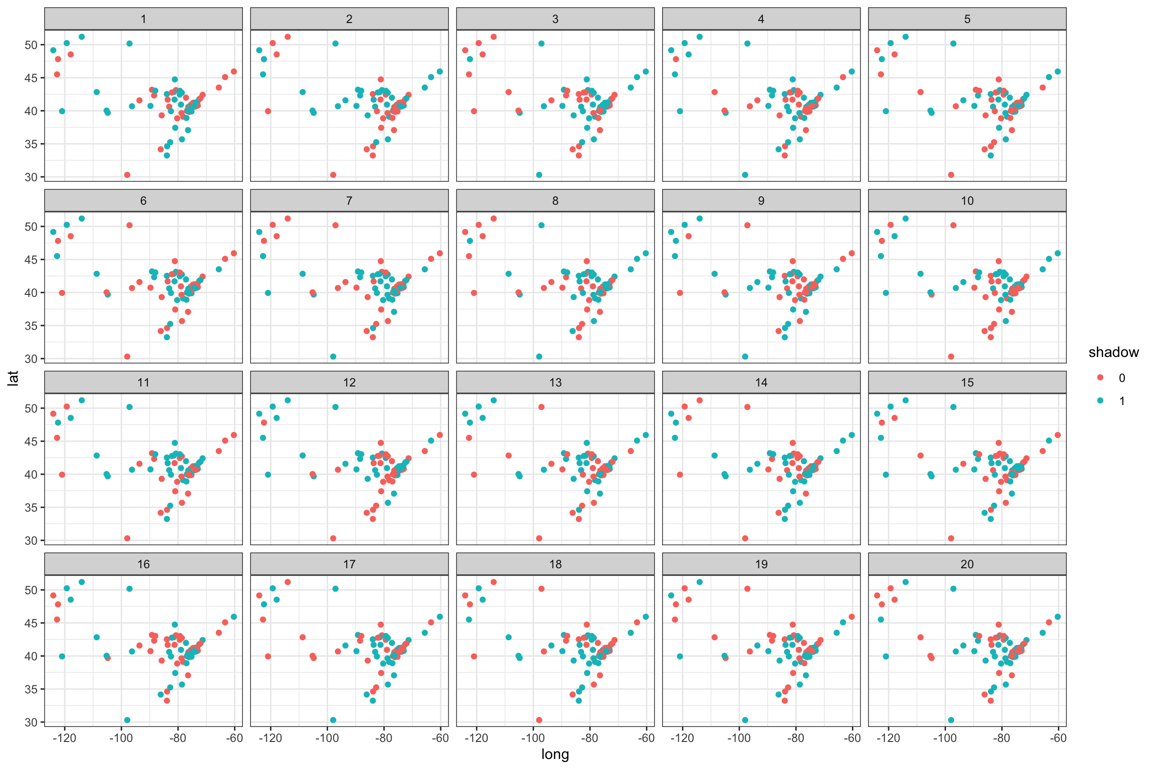
How much do North American groundhogs tend to agree on their predictions?
Do different groundhogs have different probabilities of predicting 6 more weeks of winter?
predictions <-read.csv("https://raw.githubusercontent.com/stat-assignments/eda-groundhogs/refs/heads/main/groundhog-predictions.csv")predictions %>%mutate(name =reorder(factor(name), name, length)) %>%ggplot(aes(x = name)) +geom_bar() +geom_bar(aes( weight = shadow), fill ="darkorange") +theme(axis.text.x =element_text(angle =60, hjust =1)) +ggtitle("Number of predictions\nNumber of times seeing a shadow in orange")

