
Creating Good Graphics
Grammar of Graphics Review
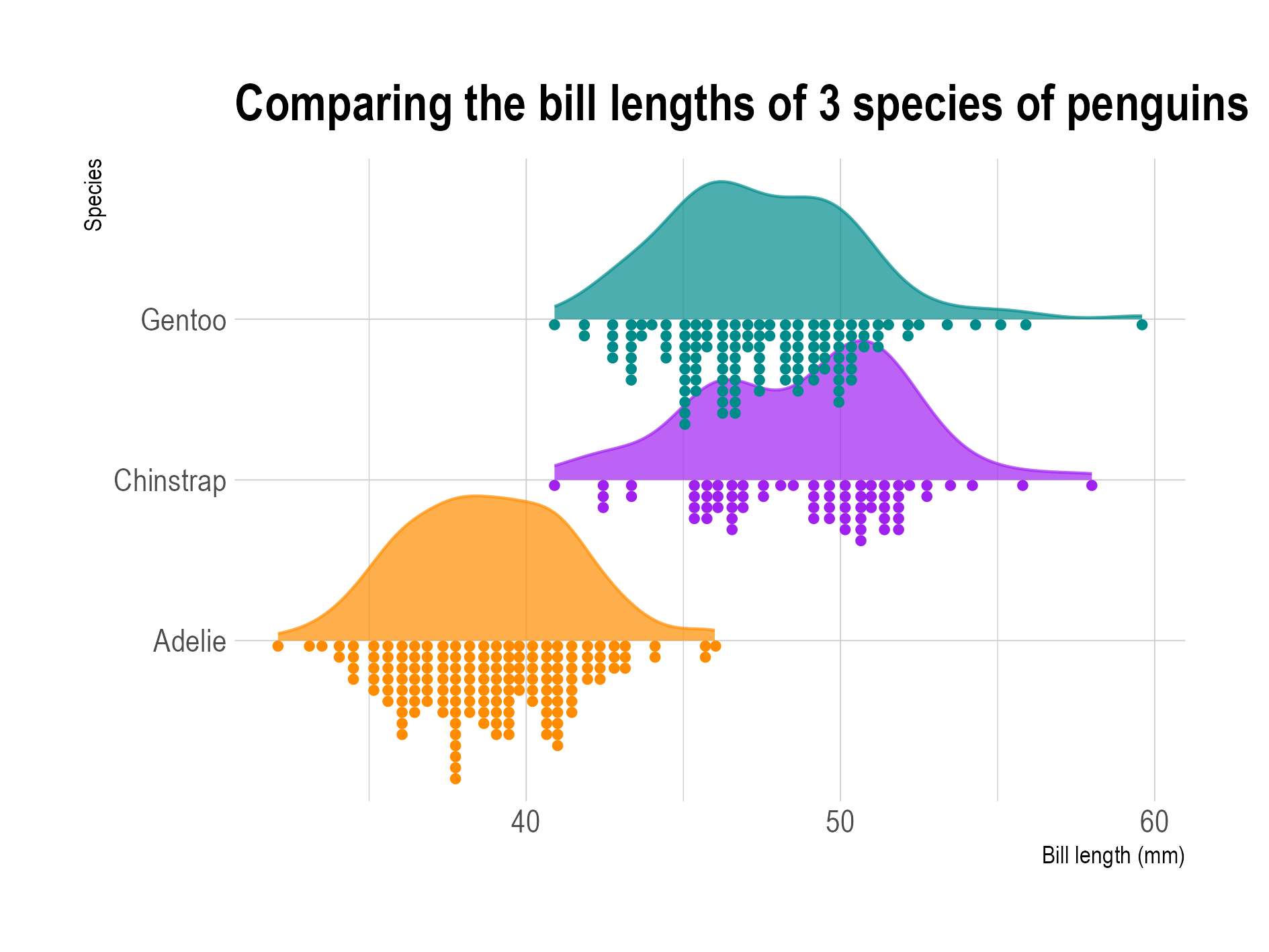
How do we describe this plot using the grammar?
- X mapping: bill length
- Y mapping: species
- color mapping: species
- geoms: Density, Dotplot
- stats: Density, Dotplot
- position: dodge?
- coordinate system: Cartesian
Grammar of Graphics Review
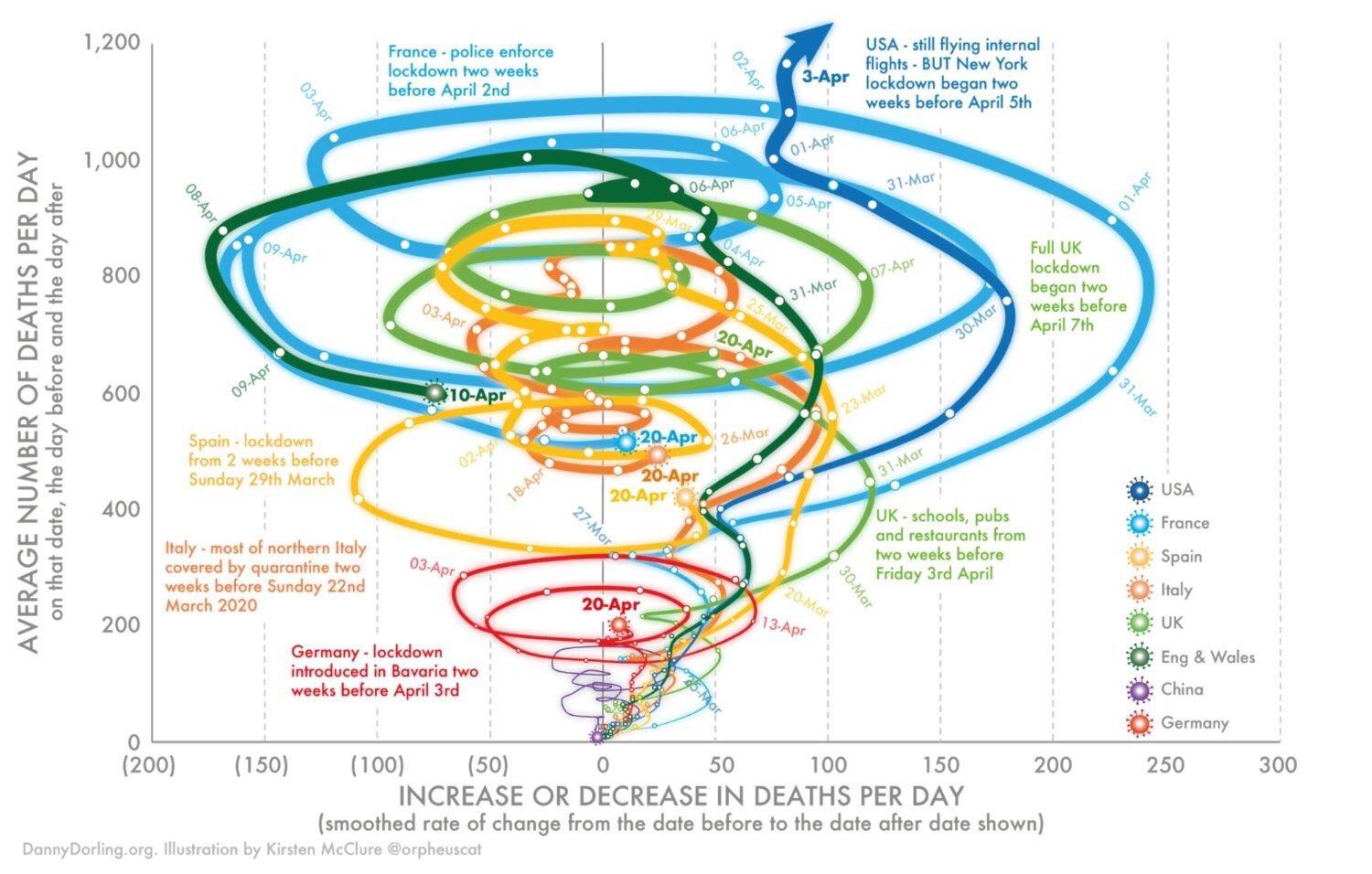
How do we describe this plot using the grammar?
- X mapping: \(\Delta\) Deaths/day
- Y mapping: Avg Deaths/day
- color mapping: Country
- label mapping: Date
- geoms: Path, Text
- coordinate system: Cartesian
Gestalt Principles of Grouping
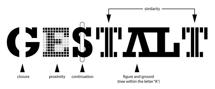
Gestalt: Closure
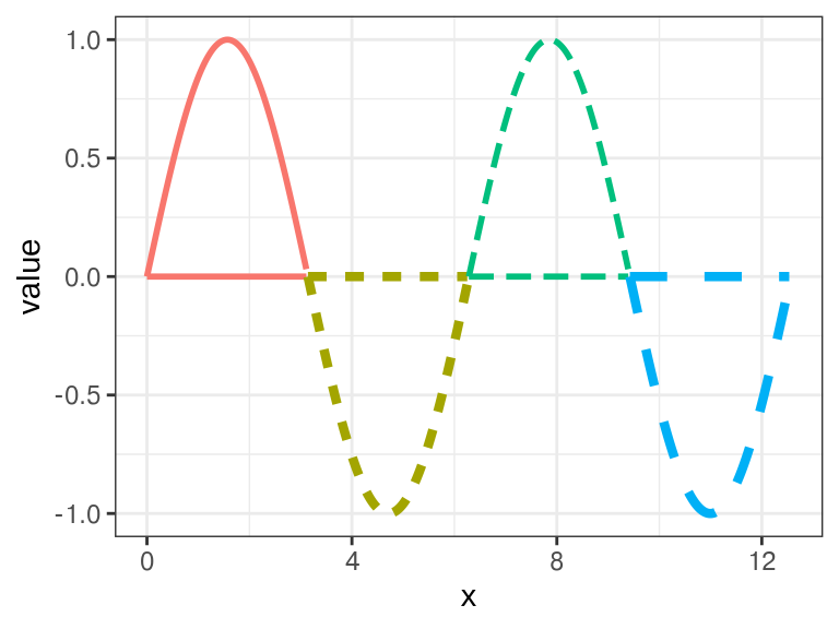
Gestalt: Good Continuation
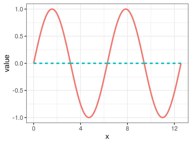
Gestalt: Good Continuation
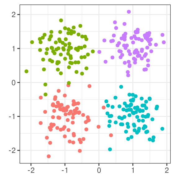
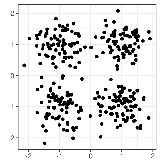
Gestalt: Proximity
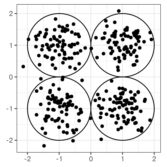
Gestalt: Proximity
Gestalt: Similarity