Creating Good Graphics
Grammar of Graphics Review
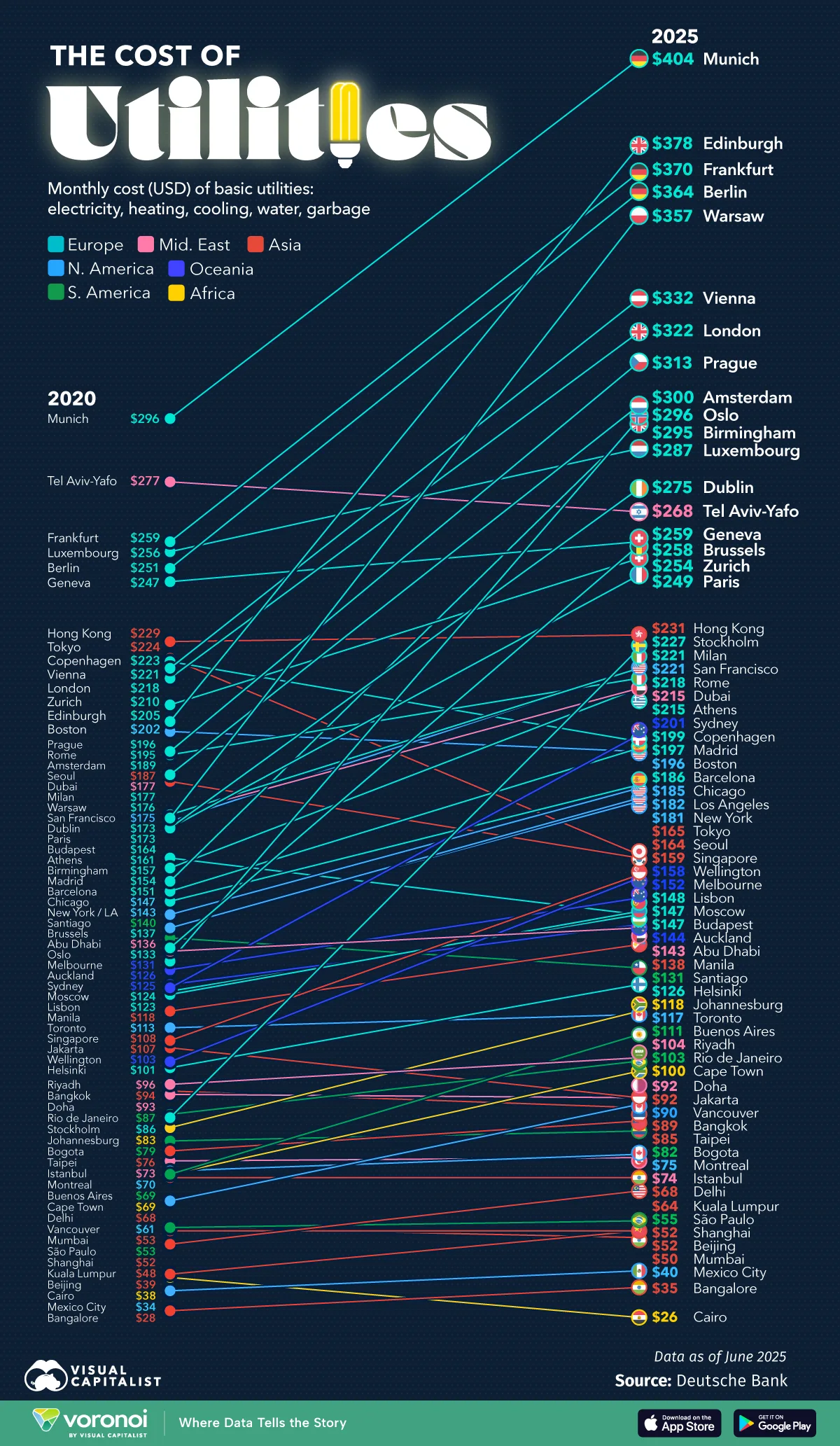
How do we describe this plot using the grammar?
- X mapping: time
- Y mapping: utilities cost
- color mapping: continent
- fill mapping: flag
- geoms: line, point
- coordinate system: Cartesian
Grammar of Graphics Review
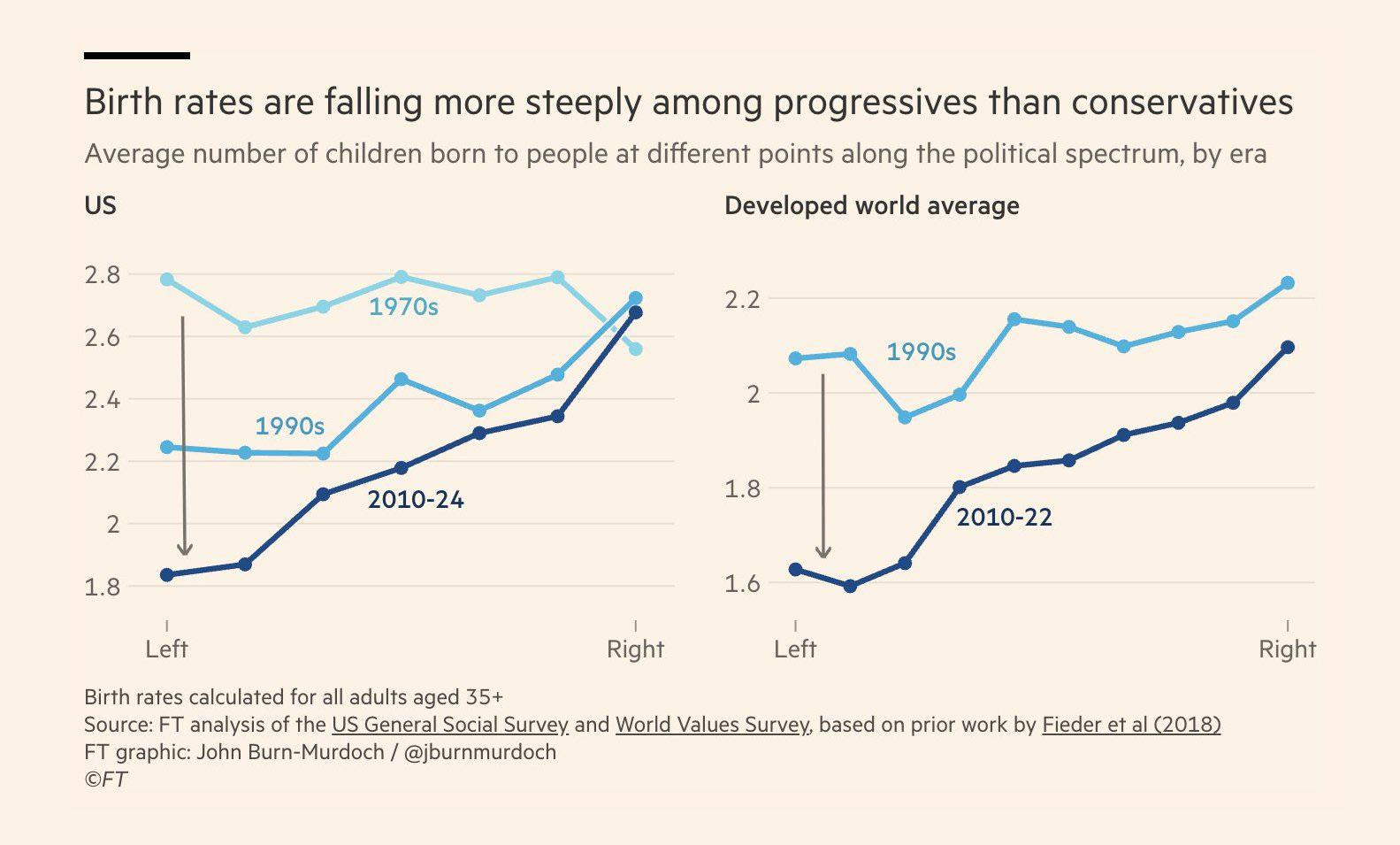
How do we describe this plot using the grammar?
- X mapping: Political spectrum
- Y mapping: Average number of children
- color mapping: Timespan
- label mapping: Timespan
- geoms: Line
- coordinate system: Cartesian
- facet: Location
Good Graphics Review
What problems do you notice in this chart?
What would you fix?
Grammar of Graphics Review
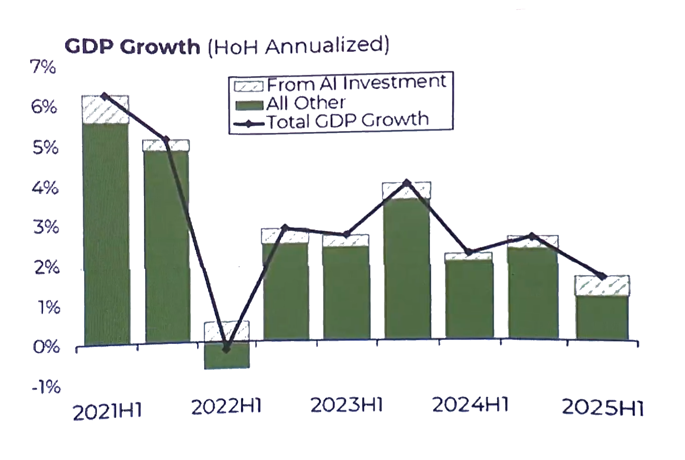
How do we describe this plot using the grammar?
- X mapping: time
- Y mapping: GDP growth
- fill mapping: Economic sector
- geoms: Bar, Line
- position: Stacked, Identity
- coordinate system: Cartesian
Grammar of Graphics Review
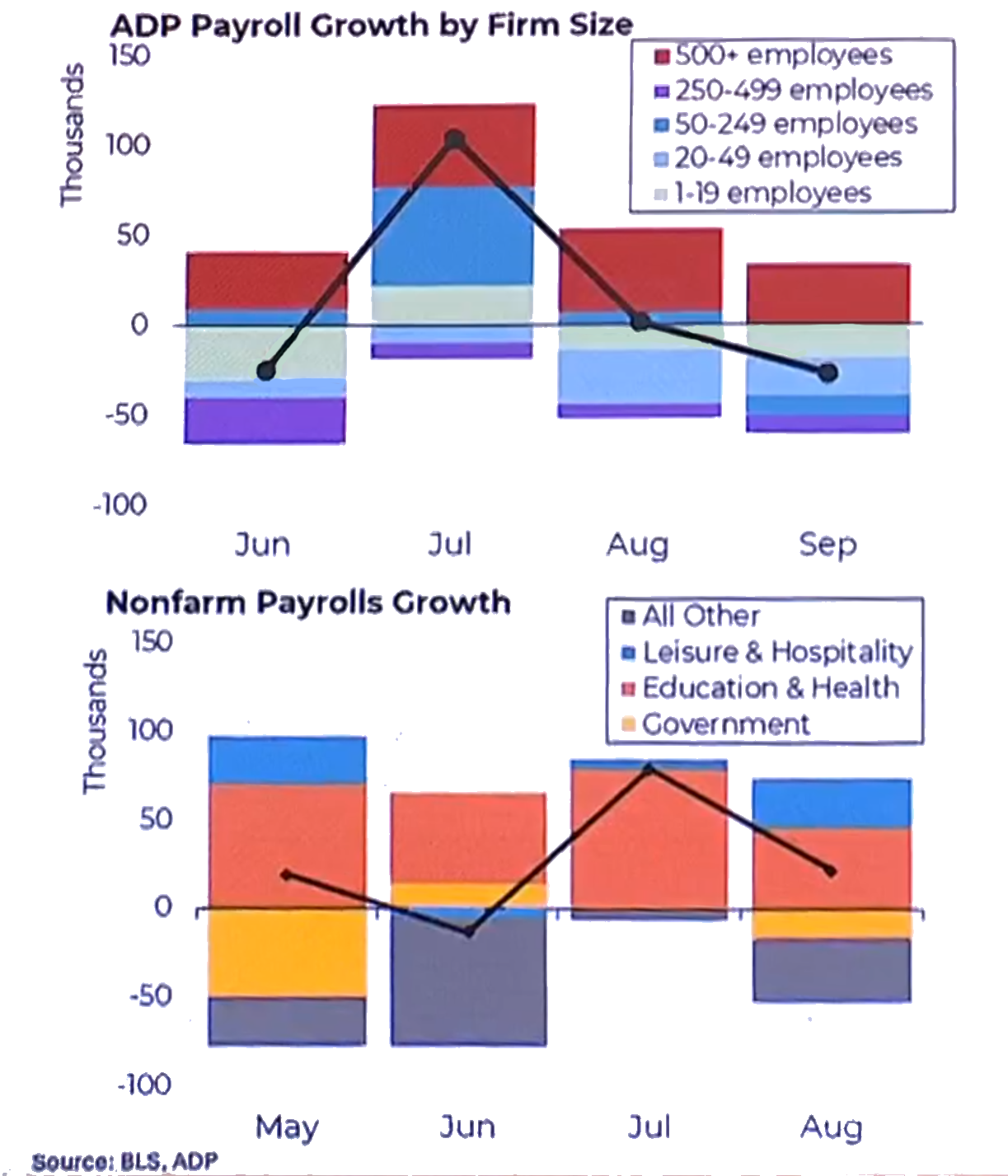
How do we describe this plot using the grammar?
- X mapping: time
- Y mapping: Payroll growth
- fill mapping: Firm size (ADP payroll), Economic sector (Nonfarm payroll)
- geoms: Bar, Line
- position: Stacked, Identity
- coordinate system: Cartesian
Good Graphics Review
What problems do you notice in this chart?
What would you fix?
